Top 20+ Shopify Dropshipping Stores in 2025
Contents
We know how hard it is to find dropshipping stores that actually work. We’ve been there too—looking for ideas, but nothing seems right. If you’re stuck choosing products or figuring out how to make your store stand out, you’re not alone.
That’s why we’ve made this list of over 20 top Shopify stores and dropshipping stores doing well in 2025. These stores can give you clear ideas to improve your own.
Key Takeaways
- Fashion Nova, Gymshark, and Cupshe are top Shopify dropshipping stores known for their niche focus and great customer experience.
- Successful stores target specific audiences, use smart marketing, and partner with trusted dropshipping suppliers.
- Tools like Sell The Trend can help automate sourcing and fulfillment, making it easier to grow your Shopify store.
- The best stores stand out with unique products, strong branding, and active customer engagement.
- Picking the right niche and high-quality dropshipping products is key to building a successful store
What Is A Shopify Dropshipping Store?
A Shopify dropshipping store is an online shop where you sell products without keeping any stock yourself. Instead, when someone buys from your shopify store, you order the product from a supplier who ships it directly to the customer.
Shopify makes it easy to set up the store and manage everything, from listing and selling products, to processing payments.
You don’t handle any inventory management or shipping, which saves time and money. This business model is popular because it has low startup costs and is simple to run from anywhere.
30 Successful Shopify Dropshipping Stores
We’ll cover every category, from clothing to furniture and more.
Look for what makes these stores work—like smart product choices, strong branding, or clever marketing—so you can try them in your own dropshipping store.
1. GetVineBox
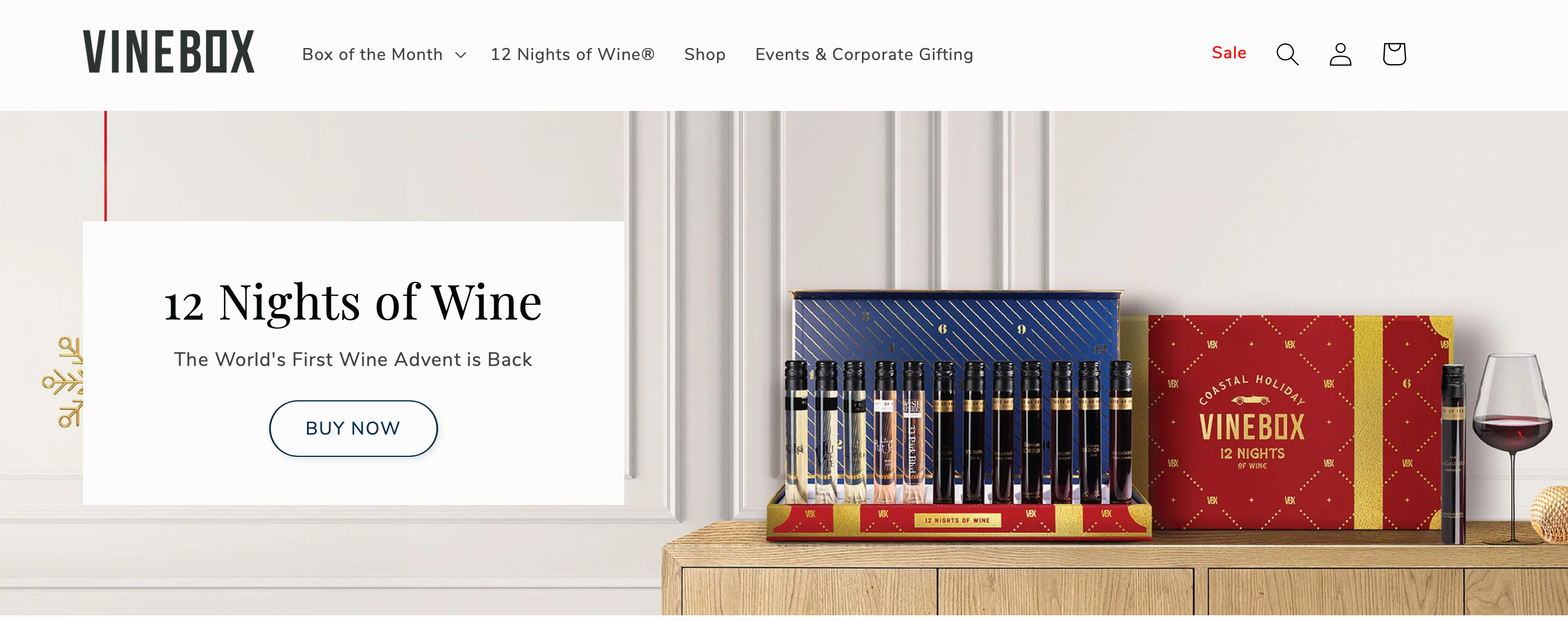
GetVineBox raised over $6 million in funding and was acquired by Sugarwish in 2021, showcasing its strong growth and position in the wine subscription market.
They sell wines by the glass, which means you can try different kinds without committing to a full bottle. This is perfect if you want to explore new flavors.
Here’s how you can learn from GetVineBox and apply these ideas to your own store
Check out the design: When you visit their website, you’ll notice it has a clean and stylish design. Take a look at their homepage.
It’s simple but gives off a high-end feel, making customers feel like they’re in for something special. You can create the same experience in your store by keeping your store design neat and professional.
Notice the pricing: Even though it looks premium, GetVineBox keeps their prices fair. Look at their product pages.
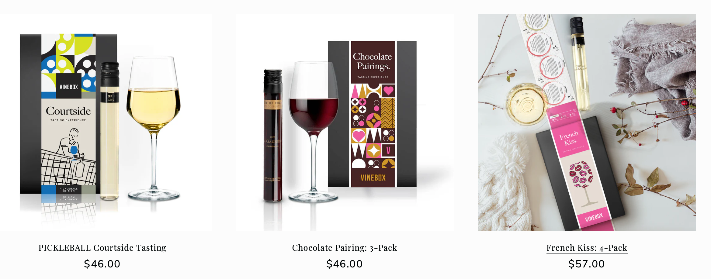
You’ll see they offer affordable options, which makes it easier for customers to try new wines. You can use this marketing and sales strategy yourself by offering affordable products that still feel luxurious.
Read the descriptions: Each wine on their website has a detailed description. They tell you about the taste, the origin, and why it’s special. This helps customers feel confident in what they’re buying.
In your store, you can add clear and helpful descriptions to make it easy for customers to trust your products.
2. Fashion Nova
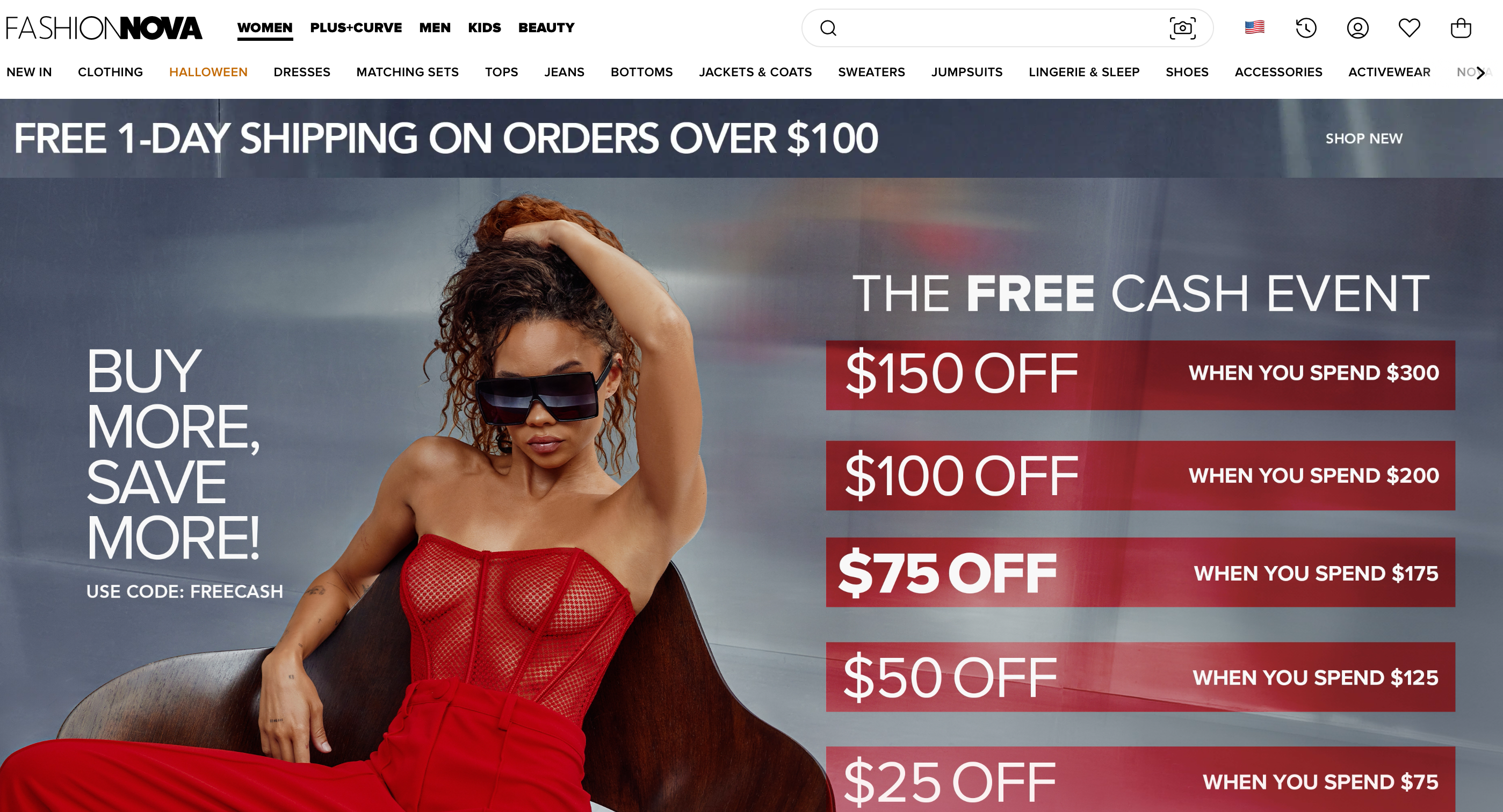
In 2025, Fashion Nova continues to dominate the fashion world, generating over $1 billion in revenue, thanks to its strong social media presence and rapid release of trendy styles. They’ve built a strong brand by constantly staying on top of the latest fashion trends and keeping customers engaged with fresh new styles.
Here’s what you can learn from Fashion Nova
Look at their bold branding: When you visit their homepage, the first thing you’ll notice is the strong visuals and bold colors. This creates excitement and draws people in. You can do the same by using bold images that match your brand’s vibe.
See how they promote sales: Fashion Nova always highlights discounts and sales. Check out their banner at the top of the page (free 1-day shipping on orders over $100).
It’s a simple yet effective way to grab attention and boost conversions. You can apply this by promoting your offers where customers can easily see them.
Customer interaction is key: Fashion Nova actively engages with customers through social media. You’ll find their Instagram feed right on their homepage.
This helps build a strong connection with their audience. You can do this too by integrating social media and encouraging customers to share their experiences.
3. Cloudies
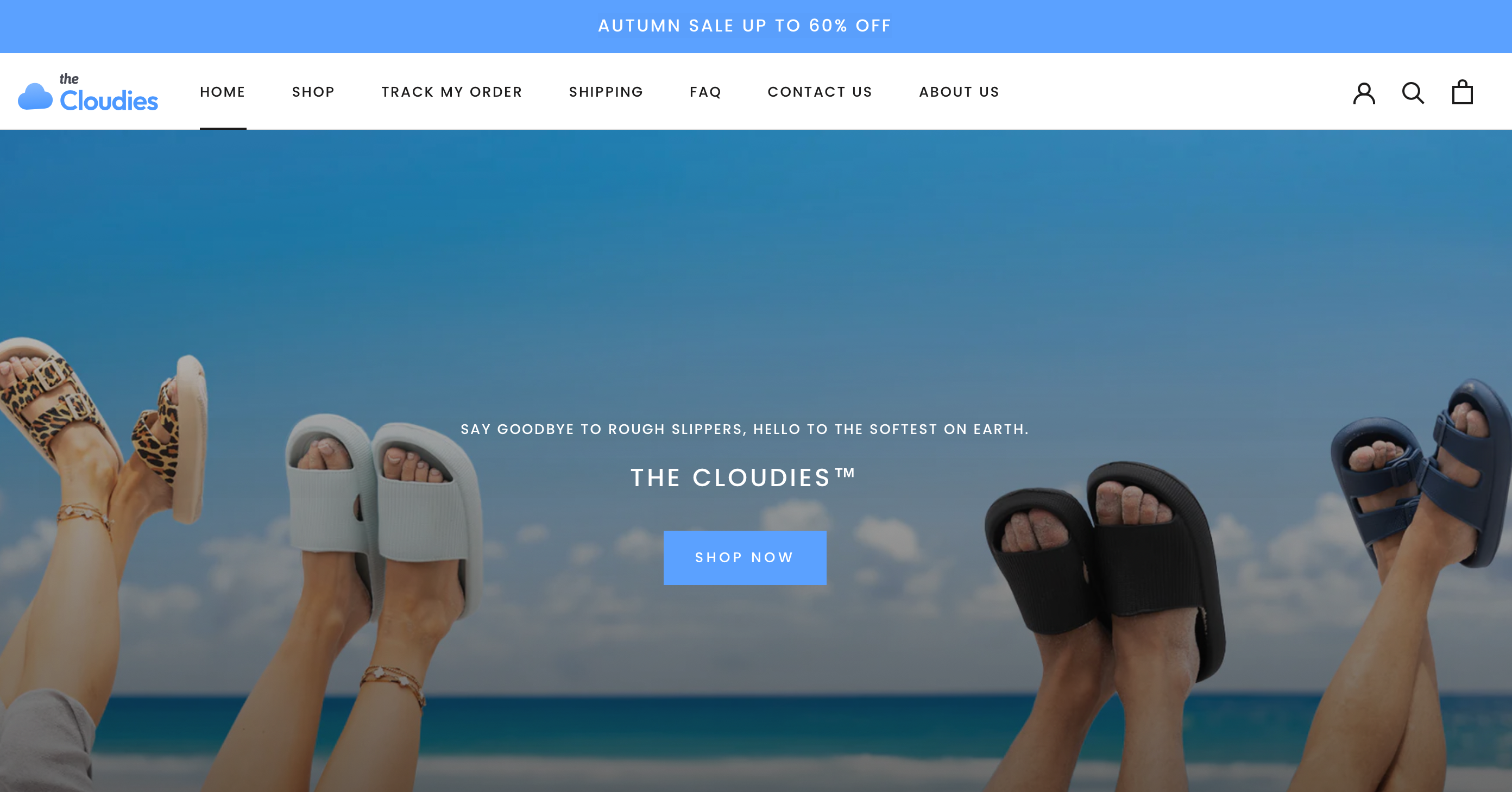
Cloudies is known for selling comfortable and stylish loungewear. They focus on providing soft, high-quality fabrics that people can relax in, making them a popular choice for comfort lovers.
With over 145,000 happy customers, Cloudies continues to be a top choice for those seeking cozy, everyday wear.
Here’s what you can learn from Cloudies
Spot their soothing design: When you land on their site, you’ll see soft pastel colors and a relaxed, cozy vibe.
This matches the comfort they sell. You can create a similar feeling on your site by using colors and visuals that reflect the mood of your products.
Check out their product display: Cloudies makes their loungewear look extra inviting with high-quality images that show the fabric up close. This helps customers imagine the comfort. You can use detailed images to show your products in the best light.

Focus on customer reviews: They have a section with customer reviews right on the product pages. This builds trust and makes new buyers feel more confident. You can do the same by encouraging the customer reviews people prefer, and displaying them where shoppers can easily see them.
4. Pillow Slides
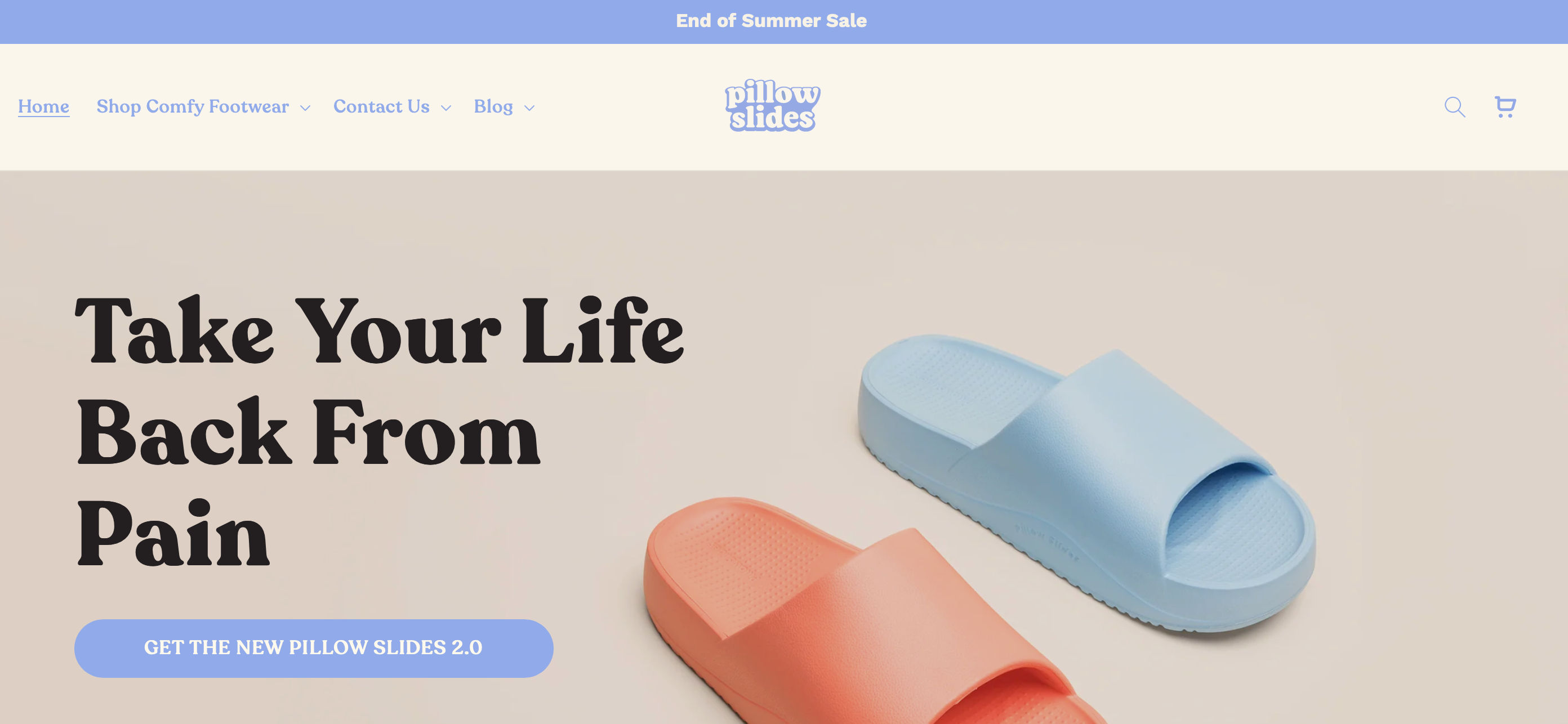
Pillow Slides specializes in soft, cushioned footwear that feels like walking on clouds. They’ve gained a loyal following for their unique product design and comfort.
With over 300,000 satisfied customers as of 2025, Pillow Slides has carved a strong niche in the comfort footwear market, specifically targeting those looking for relief from foot and joint pain.
Here’s what you can take from Pillow Slides
Notice the simple layout: Their website uses a minimalist design that highlights the product with large, clear images. There’s no clutter, making it easy to focus on the benefits. You can apply this by keeping your design clean and product-focused.
Clear value proposition: Pillow Slides explains right away why their product is special—extreme comfort and durability. They keep the message clear and direct. Make sure to explain what sets your products apart in a few simple words.
Engage with social proof: Pillow Slides prominently displays customer reviews and photos of people wearing their slides.
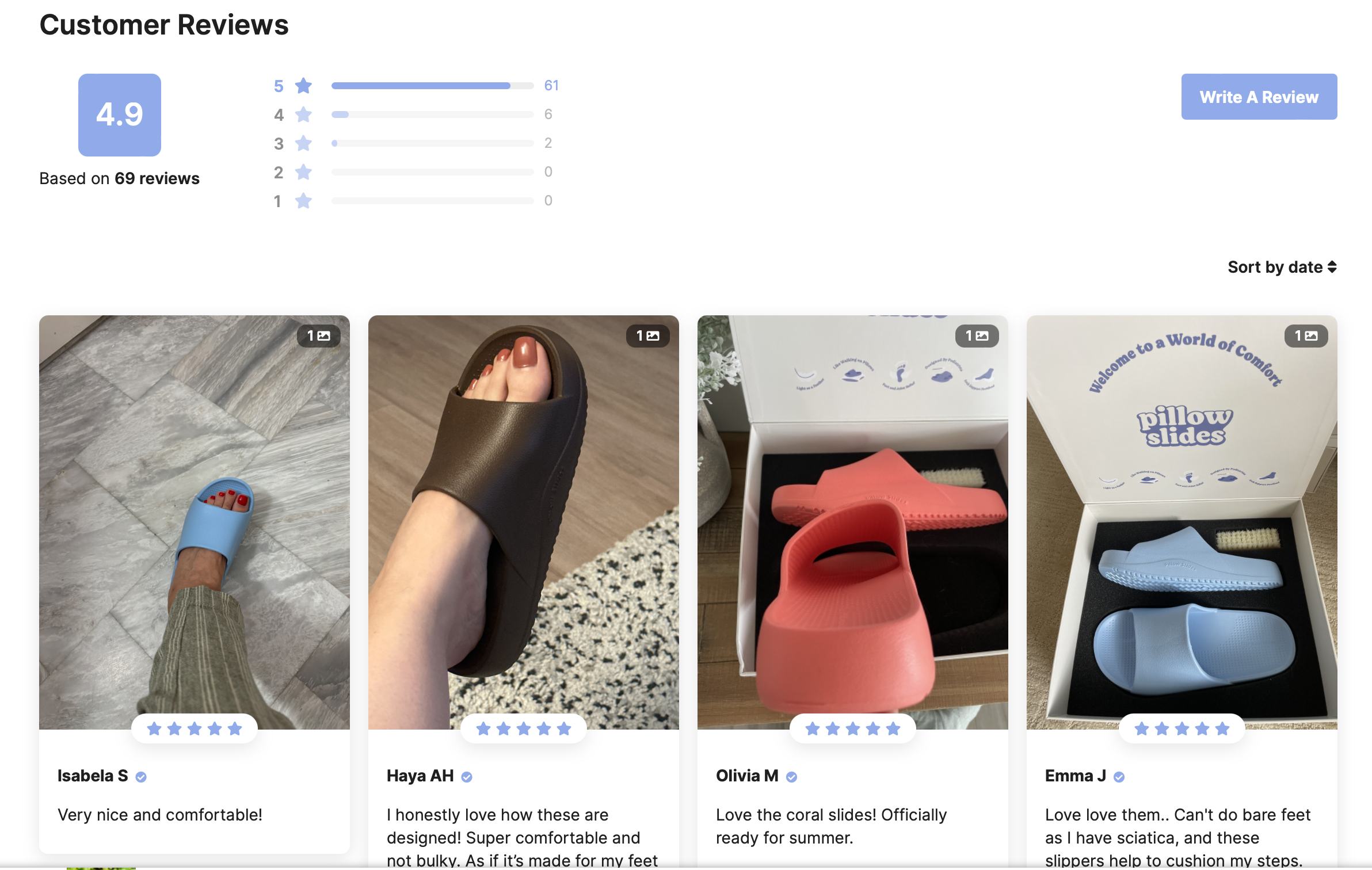
This social proof helps new customers trust the brand. You can boost your sales by doing the same with customer content.
5. Fresh Juice Blender
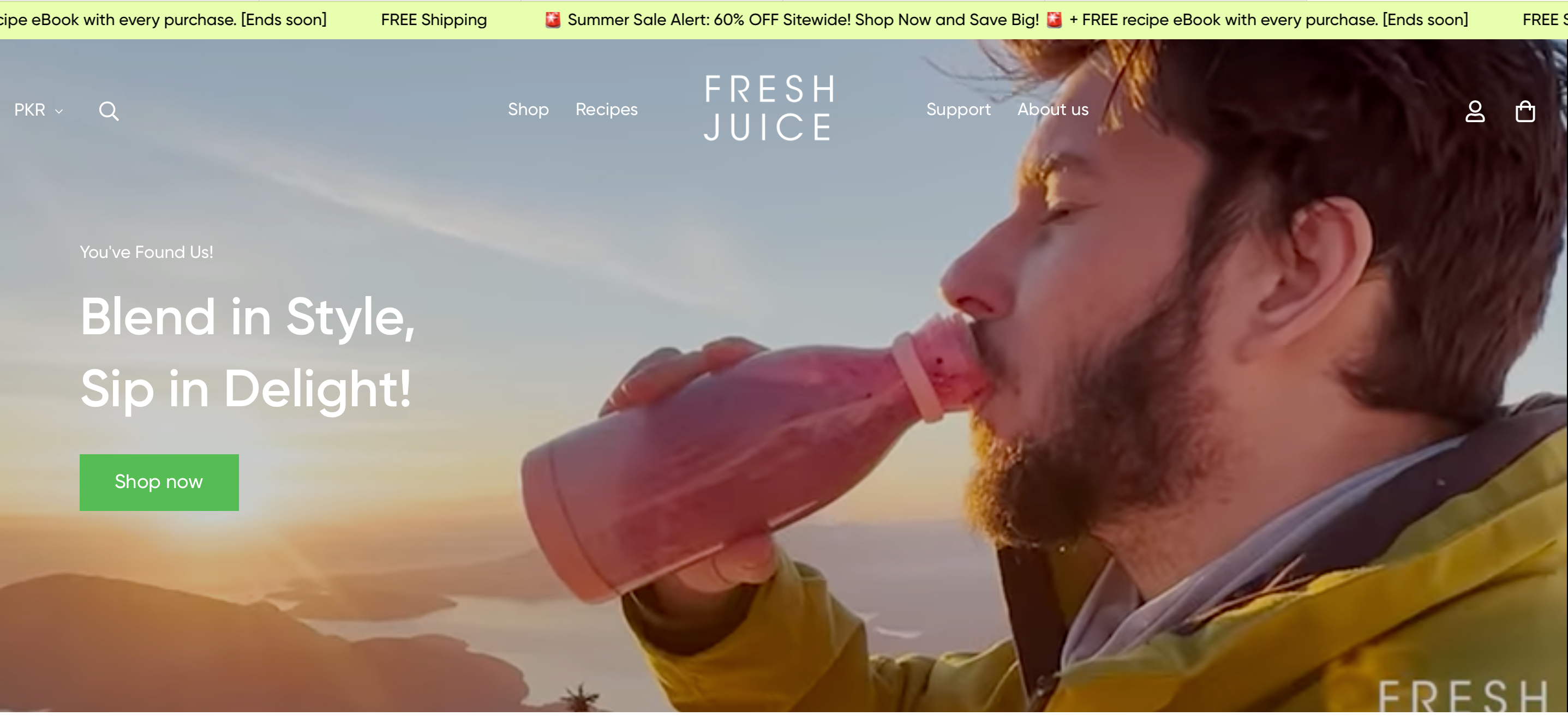
Fresh Juice Blender sells portable blenders that make it easy for customers to blend smoothies on the go. They’ve carved out a niche in the health and fitness world by offering a practical, high-demand product.
The global market for portable blenders is expected to reach $315 million by 2025, highlighting the growing popularity of these convenient, health-focused devices
Here’s how you can learn from Fresh Juice Blender
See their clear product focus: Their homepage is all about the blender. The design highlights the product’s portability and convenience. You can focus on one key product and show its benefits clearly to get attention.
Use videos to demonstrate value: They use videos to show how easy the blender is to use. It’s a powerful way to show the product in action. Try using videos to demonstrate how your product solves a problem.
Highlight features: They break down the blender’s main features with icons and short descriptions.
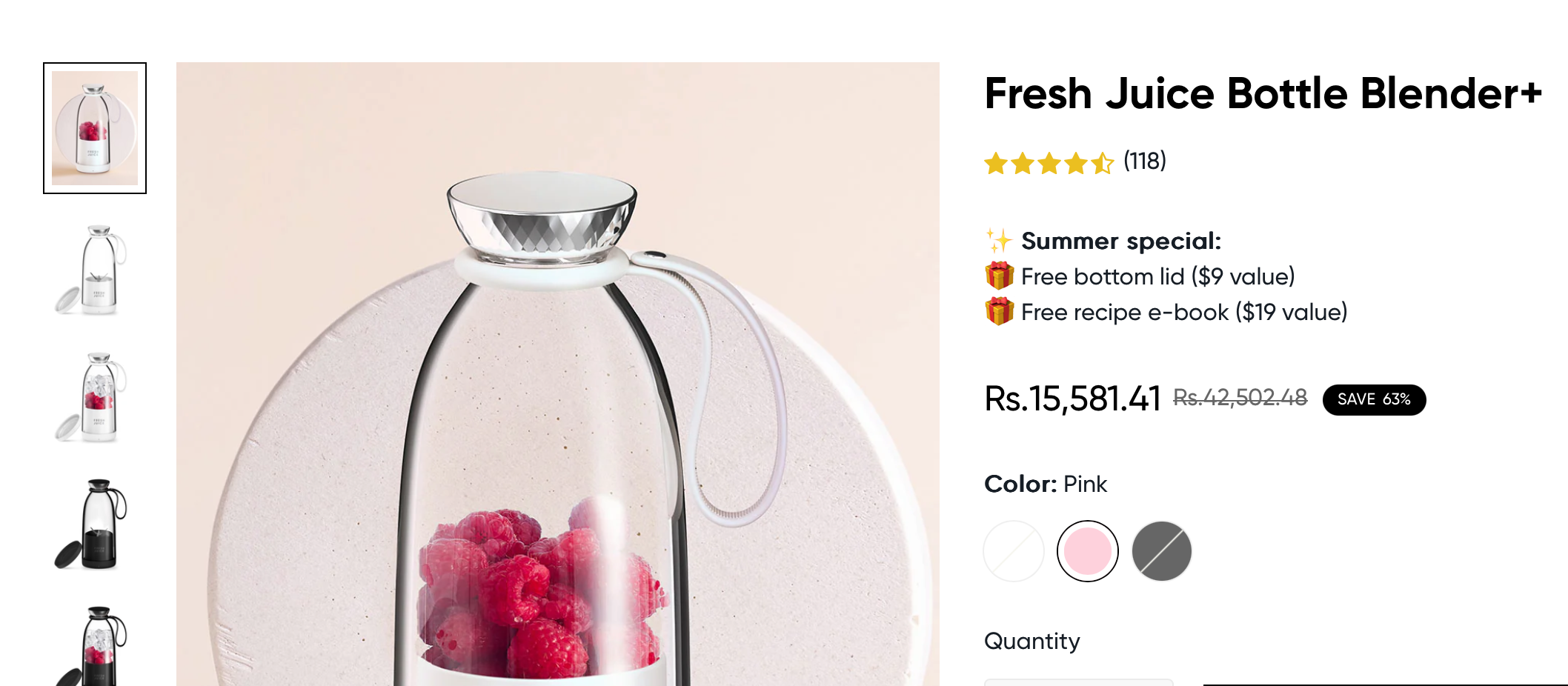
This makes it easy for customers to understand. Use simple visuals and brief points to show off your product’s best features.
6. Paddie Nails
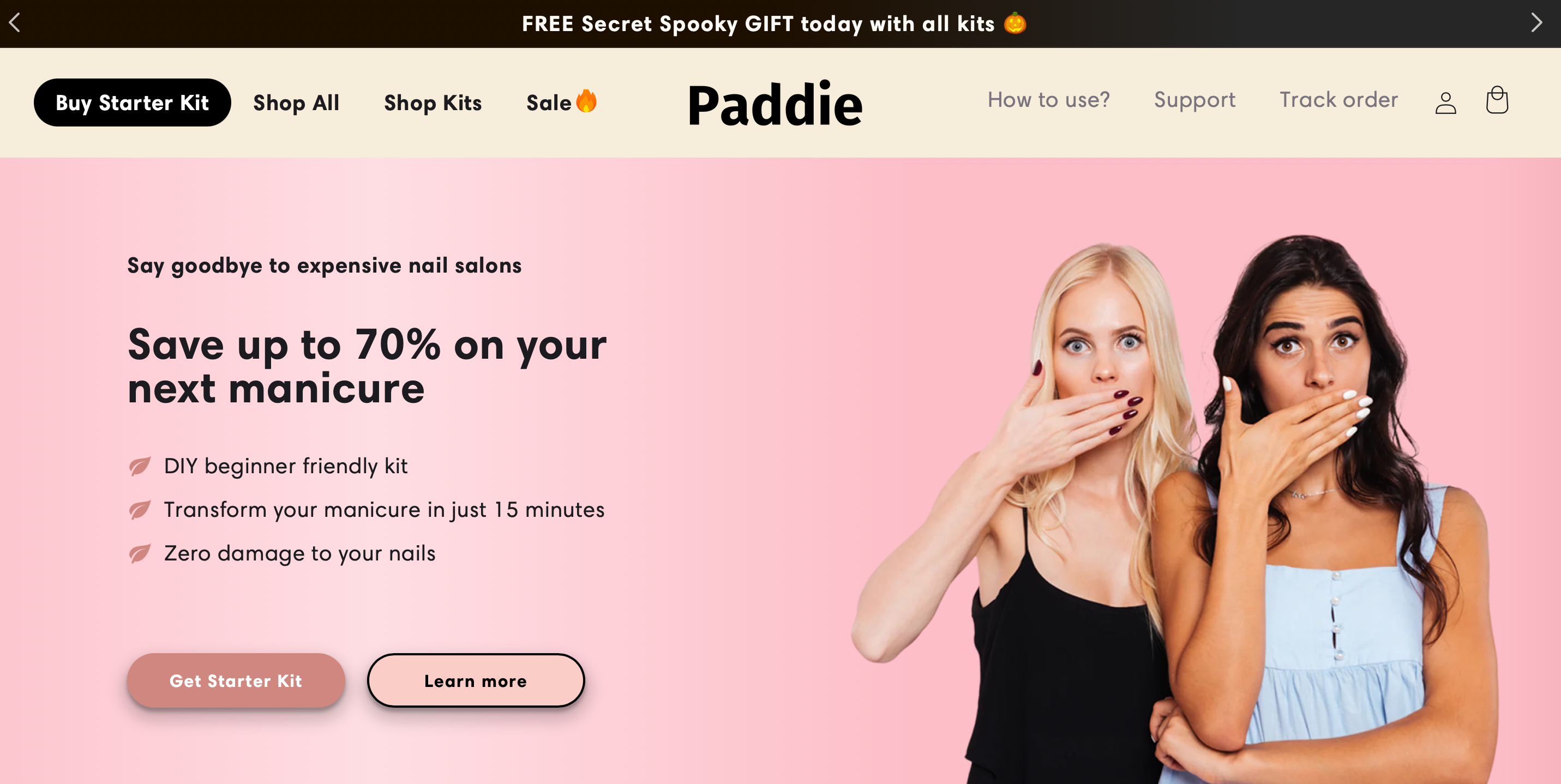
Paddie Nails offers at-home gel nail kits, making salon-quality nails accessible to everyone. They’ve grown popular by tapping into the DIY beauty trend and have served over 64,000 happy customers as of 2025.
Here’s what stands out about Paddie Nails
Easy-to-navigate layout: The website makes it simple to find everything you need, with clear categories and product pages. This smooth experience keeps customers engaged.
You can make sure your shopify ecommerce platform or store is easy to browse with simple navigation.
Educational content: Paddie Nails includes tutorials and tips for using their nail kits. This helps customers feel more confident about buying. You can use how-to guides or videos to educate your customers and add value.
Special deals: They frequently highlight discounts and limited-time offers, which create urgency.
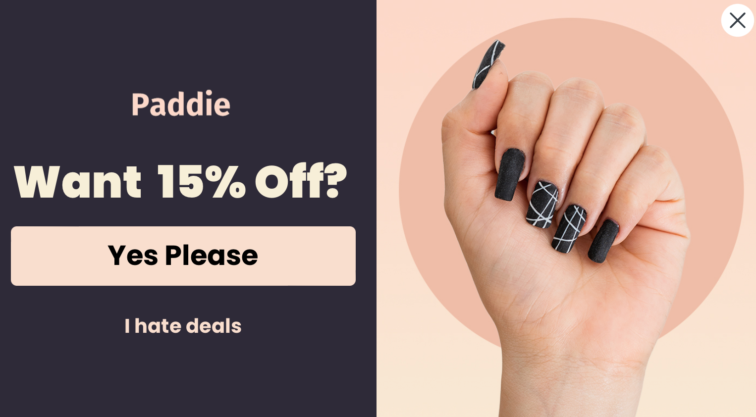
Try promoting special deals to encourage more purchases.
7. Bee Balm
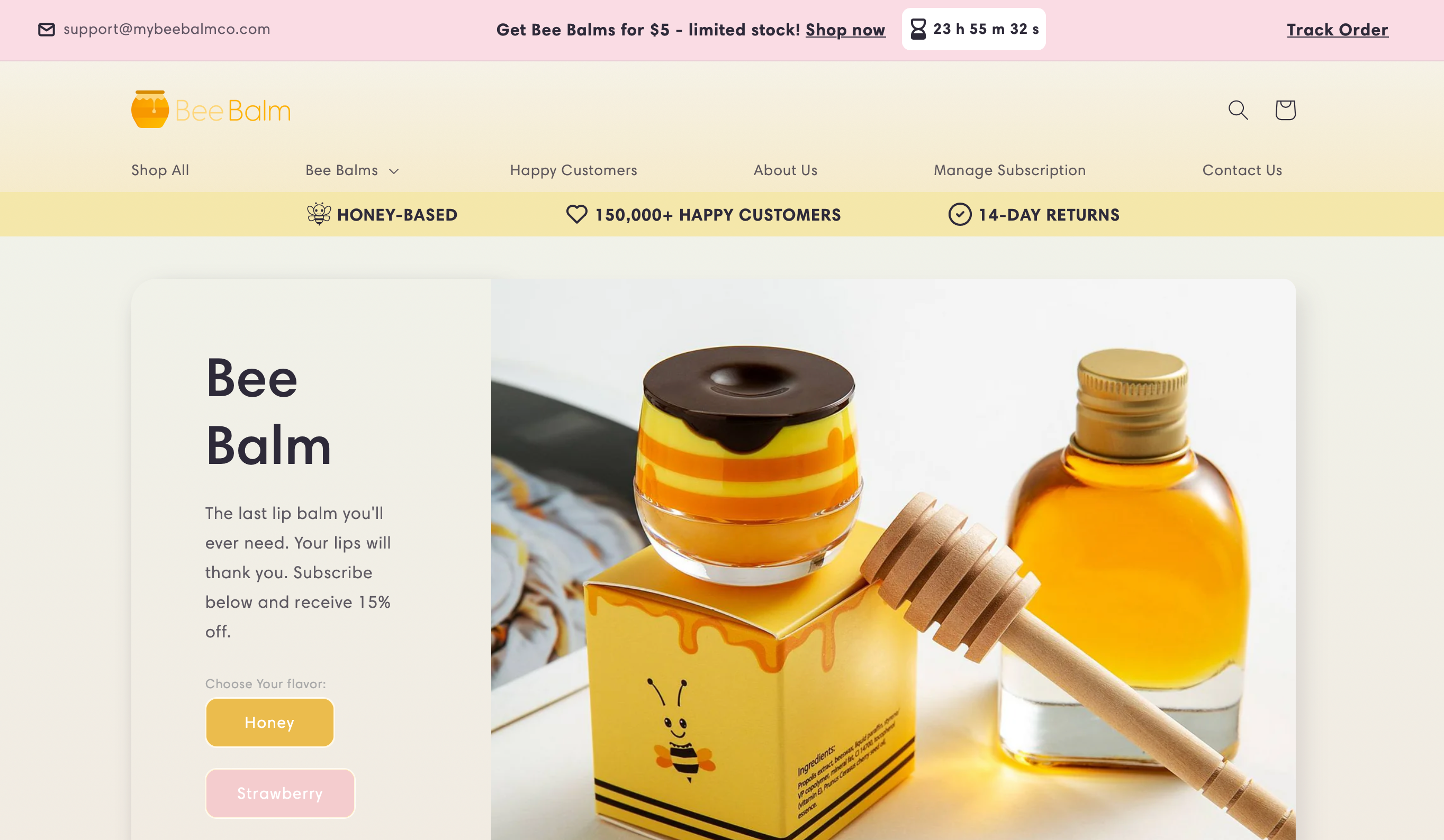
Bee Balm sells natural, cruelty-free skincare products. They’ve become popular with eco-conscious shoppers looking for clean beauty options.
Here’s what you can learn from Bee Balm
Check out their eco-friendly vibe: When you visit their homepage, you’ll notice earthy colors and images of natural ingredients. This reinforces their eco-friendly message. You can do the same by using visuals that match the values of your brand and appeal to your audience.
Notice the clear product benefits: Bee Balm highlights what’s great about each product right on the product pages. They list the natural ingredients and explain why they’re beneficial for the skin.
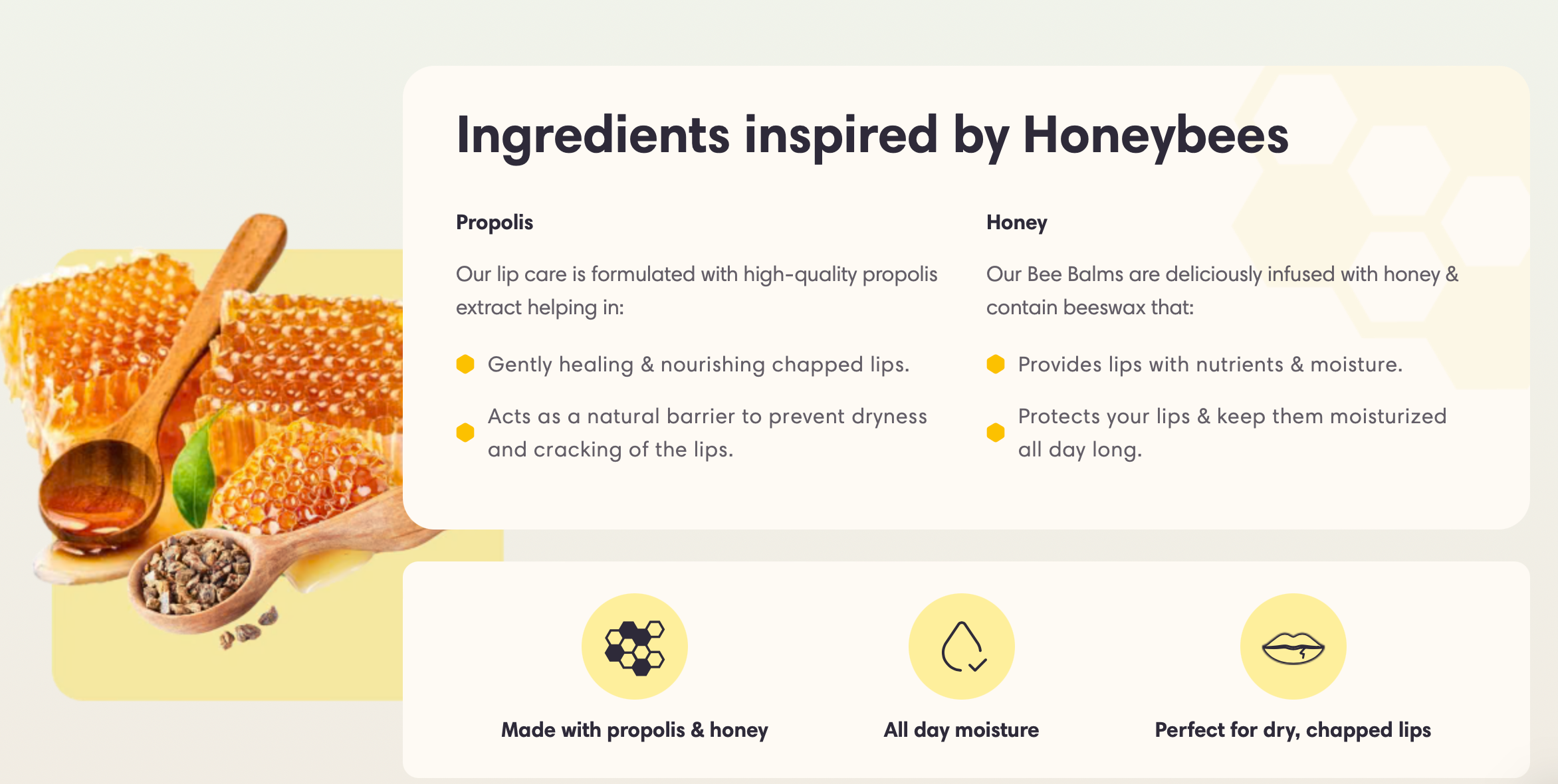
This makes customers feel confident about what they’re buying. You can help your customers by providing clear, simple benefits that show how your products solve their problems.
8. Warmly Decor
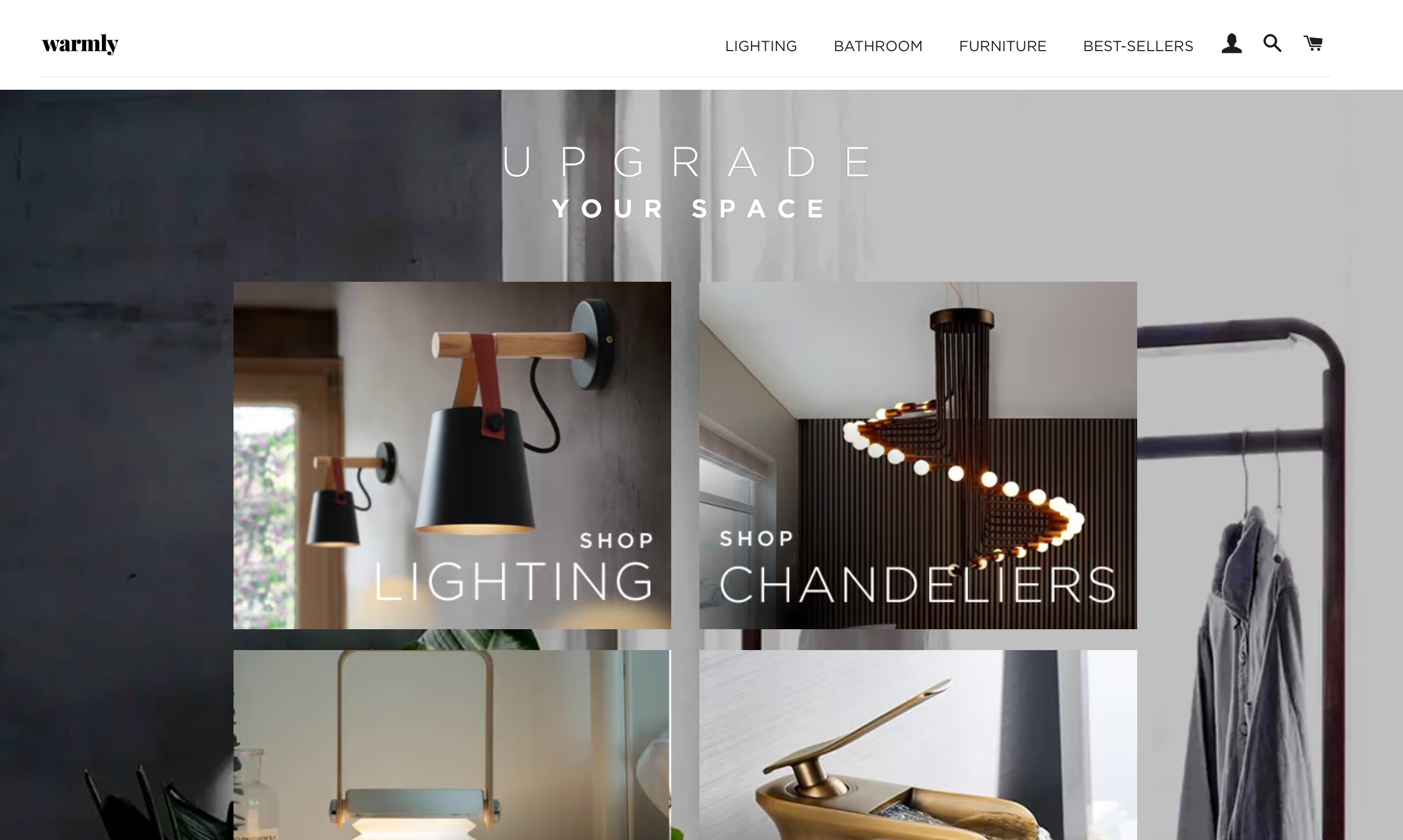
Warmly Decor has earned $3 million in 2023, selling trendy home decor products. They focus on providing stylish, affordable pieces that can transform any space.
Here’s how you can learn from Warmly Decor
See their stylish visuals: When you visit their homepage, you’ll see beautiful photos of rooms styled with their products. This helps customers imagine how the decor will look in their own homes. You can use high-quality images to create an emotional connection with your audience.
Notice how they highlight affordability: On each product page, they show affordable prices right next to the item, making it clear that style doesn’t have to be expensive. You can highlight your best prices to encourage customers to make a purchase.
Strong call to action: Warmly Decor uses strong, clear calls to action like “Shop Now” or “Get This Look” (screenshot here). These help guide customers through the buying process. Make sure your store has simple and direct calls to action that tell customers exactly what to do next.
9. Notebook Therapy
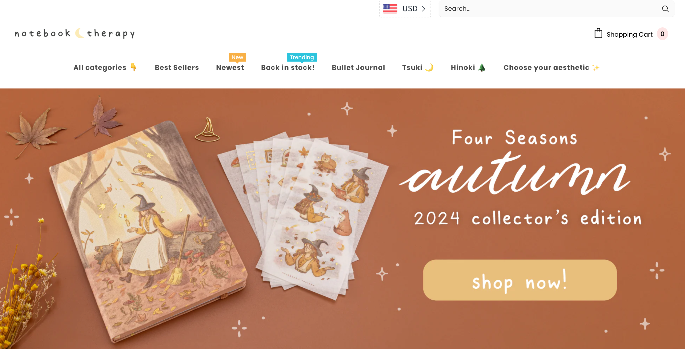
Notebook Therapy specializes in selling beautifully designed stationery and accessories. They’ve become a favorite for fans of Japanese and Korean-inspired designs.
Here’s how you can learn from Notebook Therapy
Notice the cultural influence: The website has a clear aesthetic, with Japanese and Korean-inspired designs throughout. This helps them connect with a niche audience. You can target a specific group by using visuals and products that speak directly to their interests.
Great product photography: Each product is displayed with multiple, high-quality images.
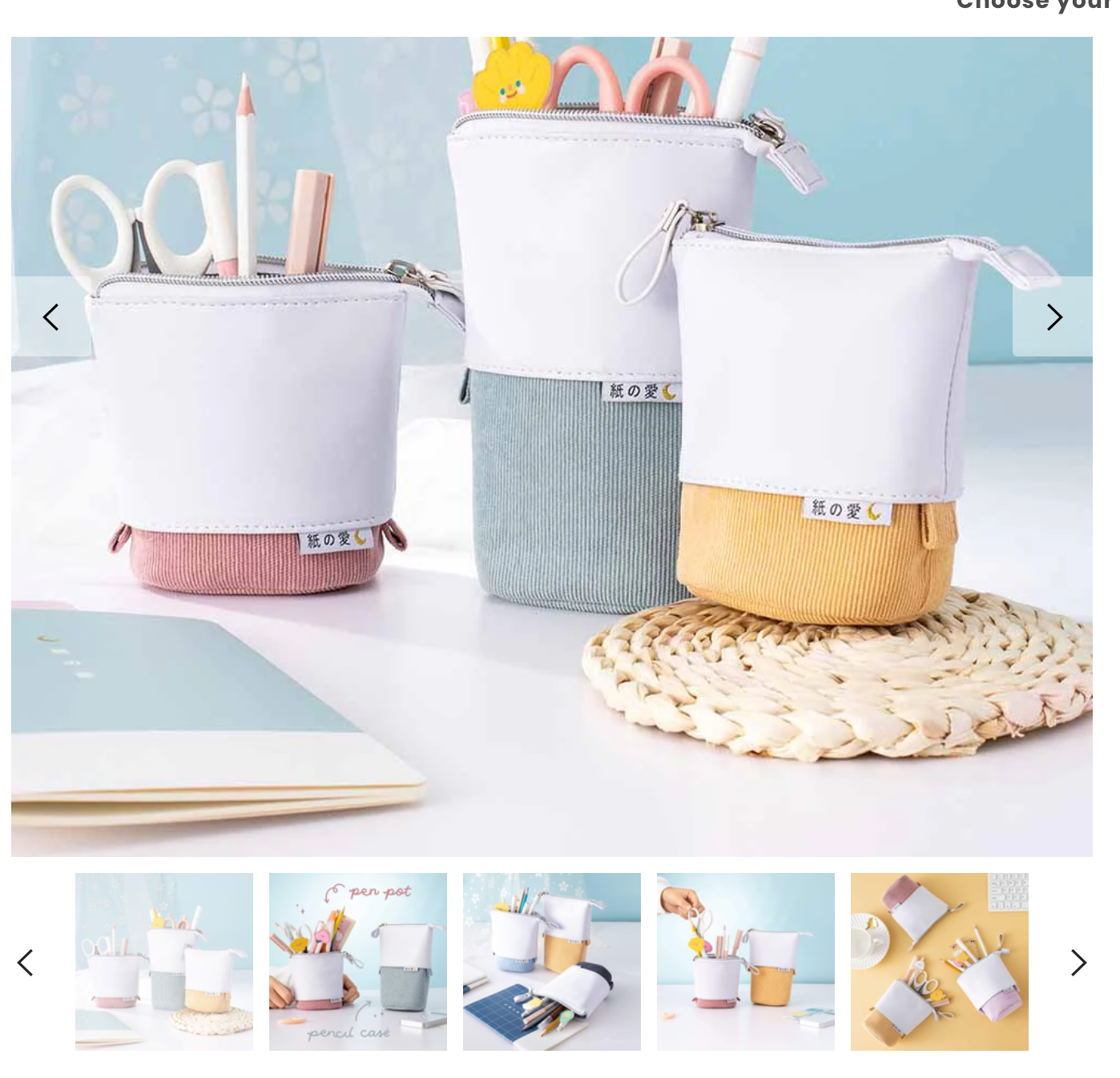
This helps customers see every detail, making them feel more confident about their purchase. Use multiple images to show off your products from different angles.
Engaging community: Notebook Therapy has a strong community of loyal customers, often sharing their purchases on social media. They highlight these posts to build trust and create excitement. You can encourage your customers to share their purchases and showcase their content on your site.
10. Best Choice Products
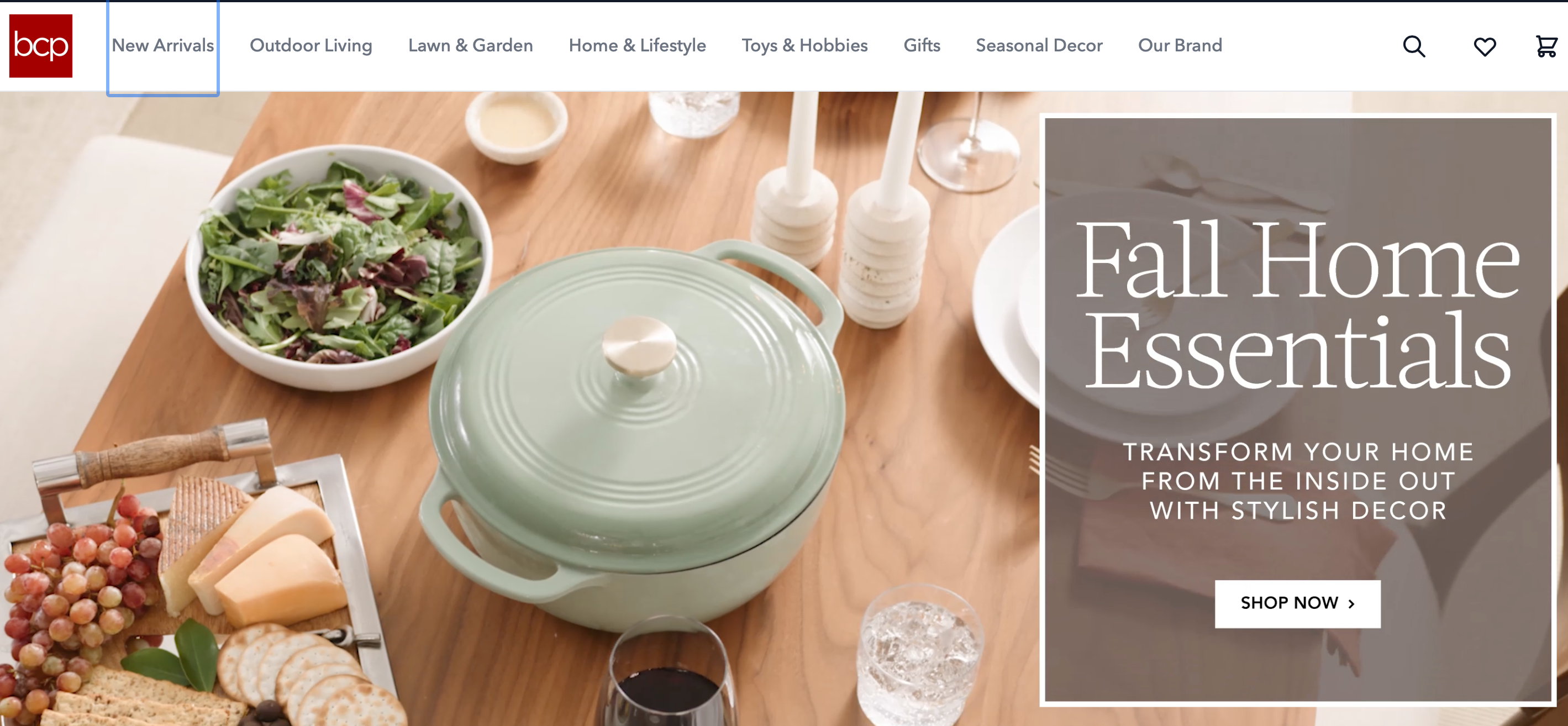
Best Choice Products is one of the top dropshipping stores, offering a wide variety of home goods, outdoor furniture, and lifestyle products. They generate over $200 million in annual revenue, making them a major player in the dropshipping industry.
Here’s what you can learn from Best Choice Products
Browse their clean layout: When you visit their homepage, the design is clear and uncluttered, making it easy to browse through their many categories. This makes the shopping experience simple and pleasant. You can achieve the same by organizing your store into clean, easy-to-navigate sections.
Spotlight on bestsellers: Best Choice Products highlights their most popular items right on the homepage. This draws customers’ attention to top-rated products. You can feature your bestsellers to help shoppers quickly find popular items.
11. Cupshe
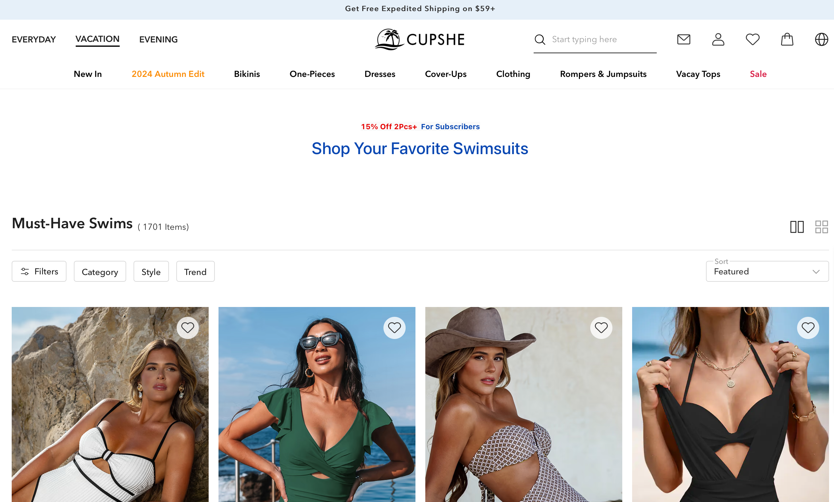
Cupshe is a well-known swimwear and fashion brand that offers trendy, affordable swimsuits, dresses, and beachwear. In 2025, they continue to attract a large customer base, with an estimated $150 million in revenue.
Let’s break down how they make their store successful
Check their bold visuals: When you visit the Cupshe homepage, you’ll notice vibrant, beach-themed images right away. These images instantly create a summer vibe and grab attention. This visual style reflects the essence of their brand and makes customers feel excited about buying beachwear. You can use the same idea by picking images that reflect your product’s style and mood.
Explore the easy-to-navigate categories: If you click on the Swimsuits or Dresses tabs, you’ll see how clearly they’ve divided their site into categories.
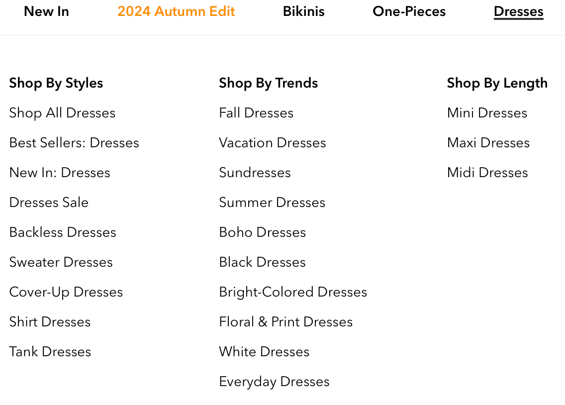
This makes it super easy for shoppers to find what they want without any confusion. You can apply this to your store by organizing your products into clear sections to give customers a smooth experience.
12. Be Activewear
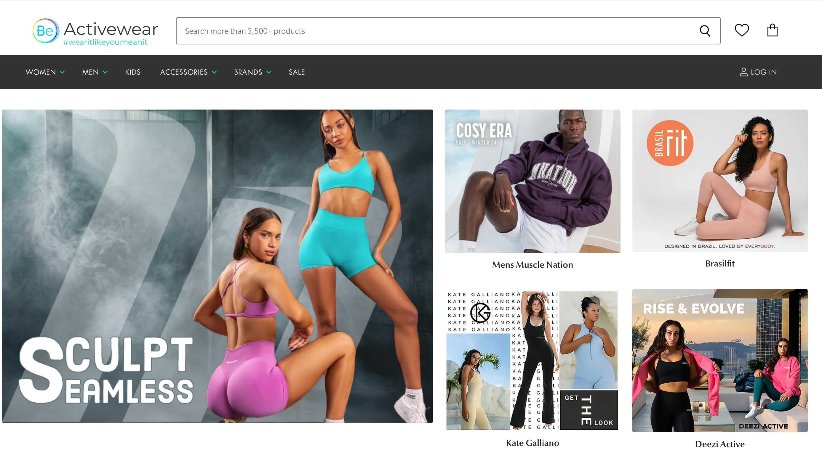
Be Activewear is a popular choice for fitness enthusiasts, offering high-performance activewear at affordable prices. They’ve built a strong community of loyal customers who love their stylish and comfortable clothing.
Here’s what you can take from Be Activewear
Focus on the community: Be Activewear highlights their community with customer photos wearing their products. This creates a sense of belonging for new buyers. You can build a community around your brand by encouraging existing customers to to share their experiences and showcasing them on your site.
User-friendly product filters: They make it easy to find exactly what you need by offering filters for size, color, and style. This helps customers narrow down their options and find the right fit. Make it easy for your shoppers to browse your products by adding helpful filters to your store.
13. SuperShop
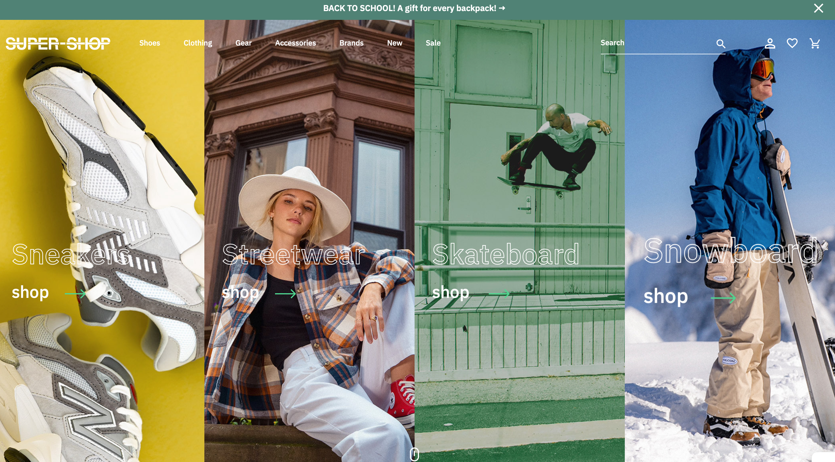
SuperShop is known for offering electronics, accessories, and home essentials. Their focus on providing quality items at discounted prices has made them a go-to for bargain hunters.
Here’s what you can learn from SuperShop
Notice their clean layout: When you visit the homepage, you’ll see a simple, user-friendly design that showcases their best deals right away. This keeps customers focused on their top offers. You can keep your store’s design clean and highlight your main products or discounts to grab attention.
Effective use of sales banners: SuperShop uses bold banners to promote their latest sales and discounts. These banners are hard to miss and drive customers toward special offers. You can apply this by adding clear, eye-catching banners that guide customers to your best deals.
Easy returns and free shipping: They make it clear that they offer free shipping and easy returns (screenshot here). This builds trust and encourages shoppers to complete their purchases. Offering hassle-free returns and shipping can increase your conversion rates by making customers feel more secure.
14. Ring To Perfection
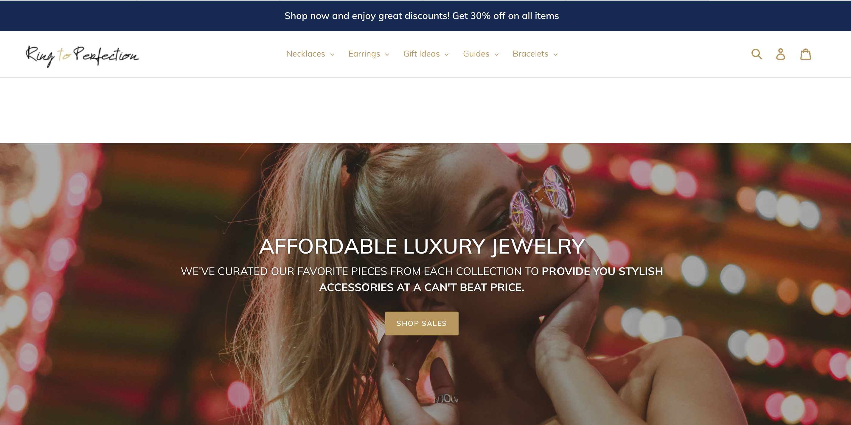
Ring To Perfection focuses on selling unique, customizable jewelry. They’ve built a strong following by offering personalized options that appeal to customers looking for something special.
Here’s what you can take from Ring To Perfection
Personalized experience: As soon as you land on their website, you’ll notice that they focus on customizable jewelry. This personal touch makes customers feel like they’re getting something unique. You can add customization options to your products to give your customers a more personalized experience.
Interactive customer content: They feature customer reviews and photos of satisfied customers wearing their jewelry. This social proof helps build trust and encourages new customers to buy. You can showcase your customers’ experiences to boost credibility and engagement.
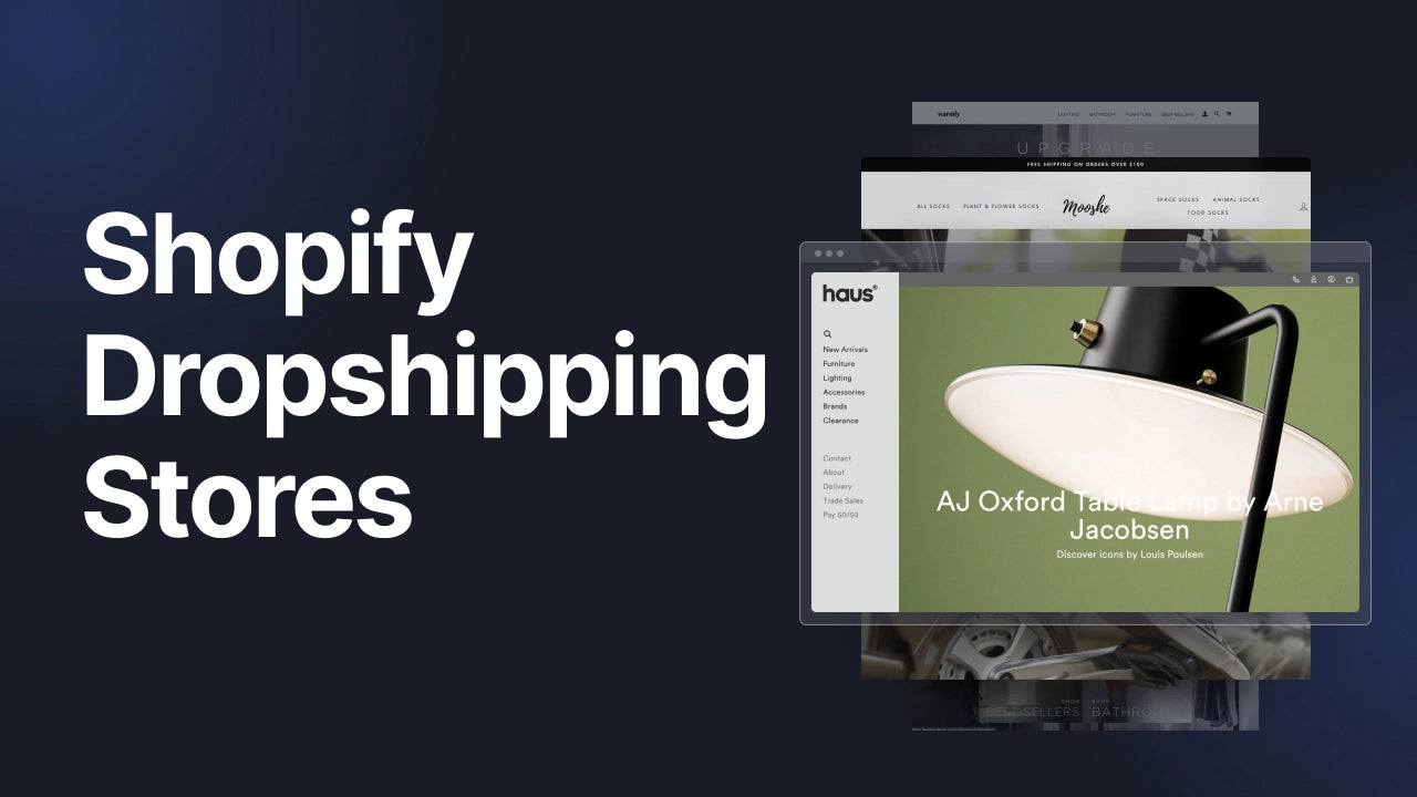
15. Haus
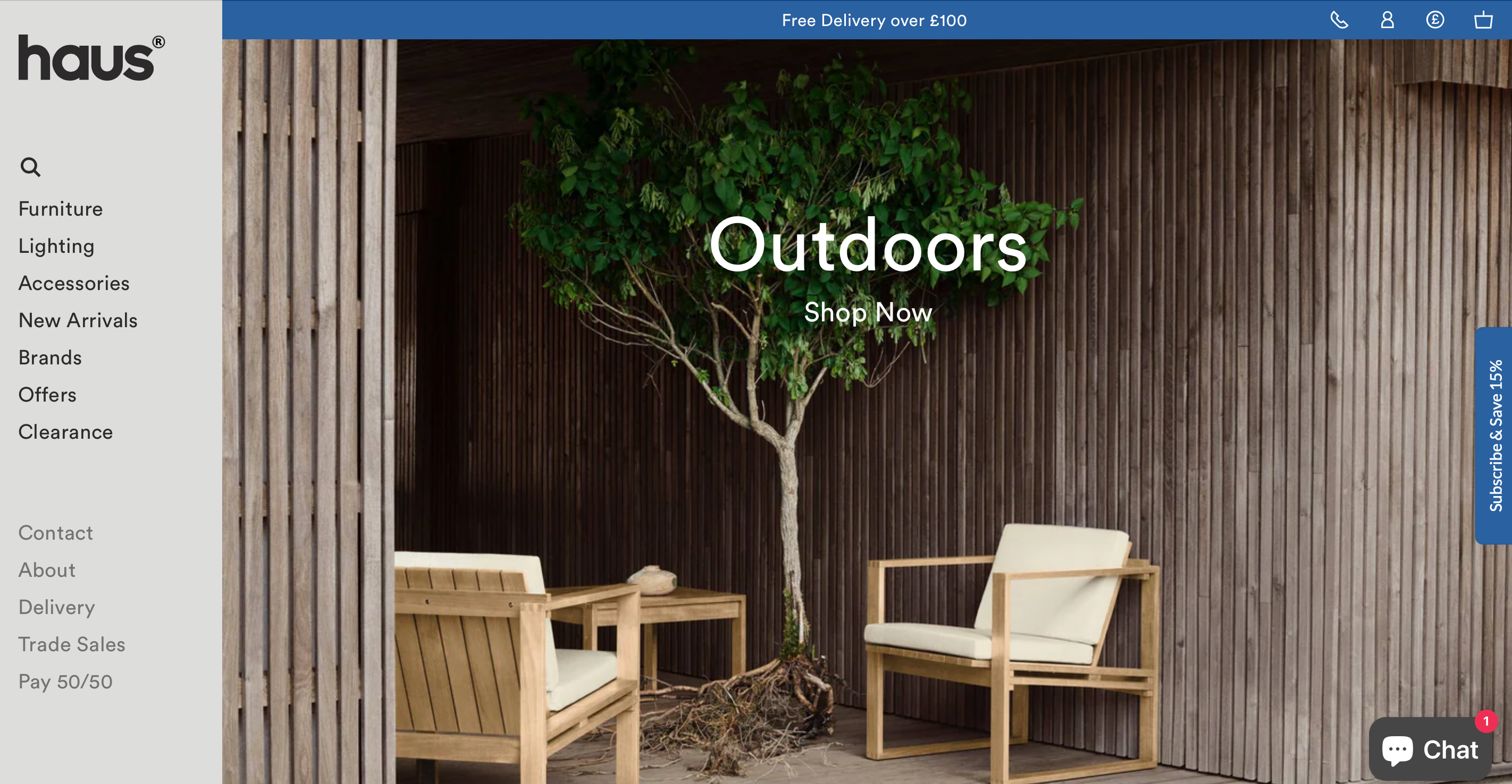
Haus specializes in contemporary furniture, lighting, and home accessories, focusing on timeless designs from world-renowned brands. They offer modern, high-quality pieces for stylish interiors.
The store’s focus on quality and modern design has helped it maintain a strong presence in the home decor market.
Let’s see how Haus London excels
Explore their premium branding: When you visit the Haus London homepage, you’ll notice a sleek, minimalist design. The clean, simple layout emphasizes their curated collection of premium furniture and homeware. This gives the site a high-end feel, making customers expect quality and style. You can use this strategy by creating a clean, elegant design that showcases your products as premium.
Notice their organized categories and product filters: On their site, you’ll find well-structured categories, like Furniture, Lighting, and Accessories. These sections make it easy for customers to find what they’re looking for. You can organize your products into clear, easy-to-navigate categories to give customers a smooth shopping experience.
16. Mooshe Walks
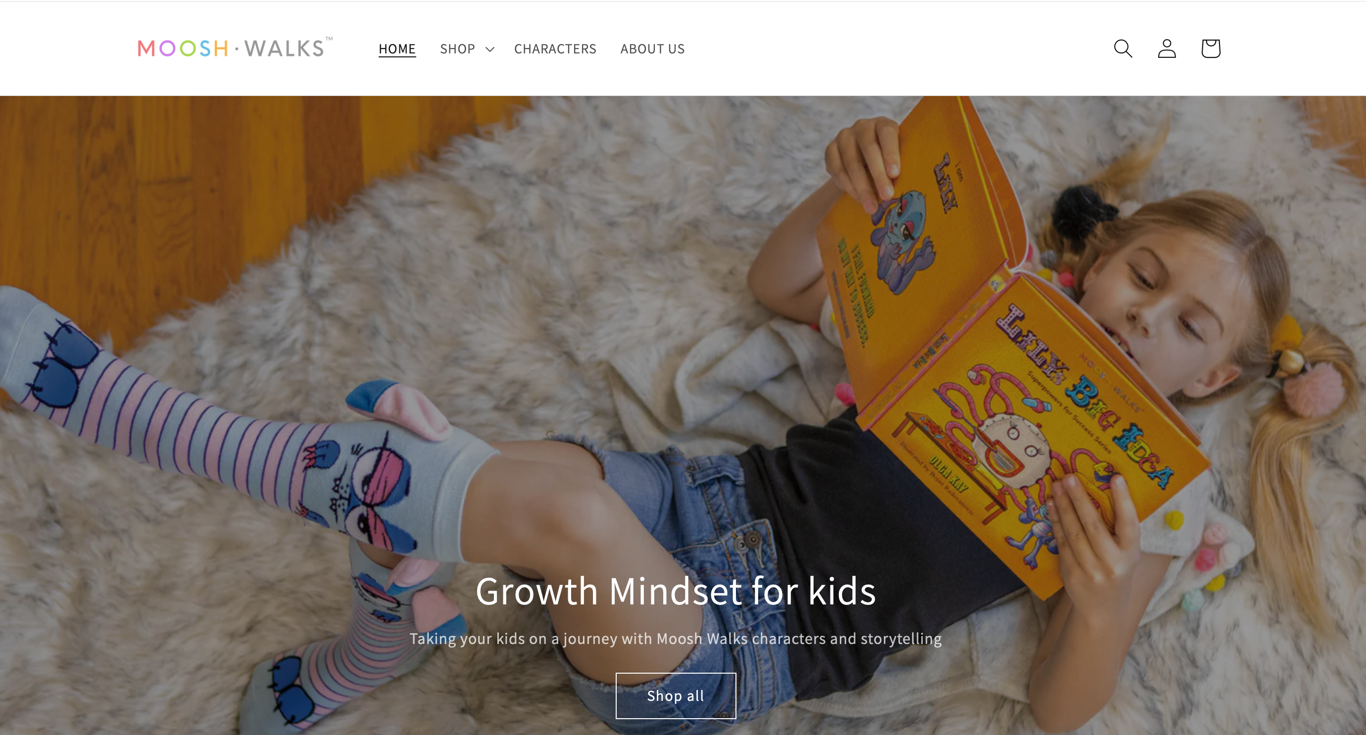
Mooshe Walks is a fun and creative brand offering character-themed socks and accessories. Their goal is to empower young girls through playful designs and storytelling. They’ve gained a loyal following through their unique, personality-driven products.
Here’s what you can learn from Mooshe Walks
Playful branding: When you visit their homepage, you’ll notice the vibrant, playful design that matches the fun nature of their products. This instantly sets a positive tone. You can create a fun, memorable experience for your customers by aligning your website’s style with your product’s vibe.
Explore their interactive shopping experience: On Moosh Walks, you’ll find fun animations and descriptions that let you “meet” the characters.
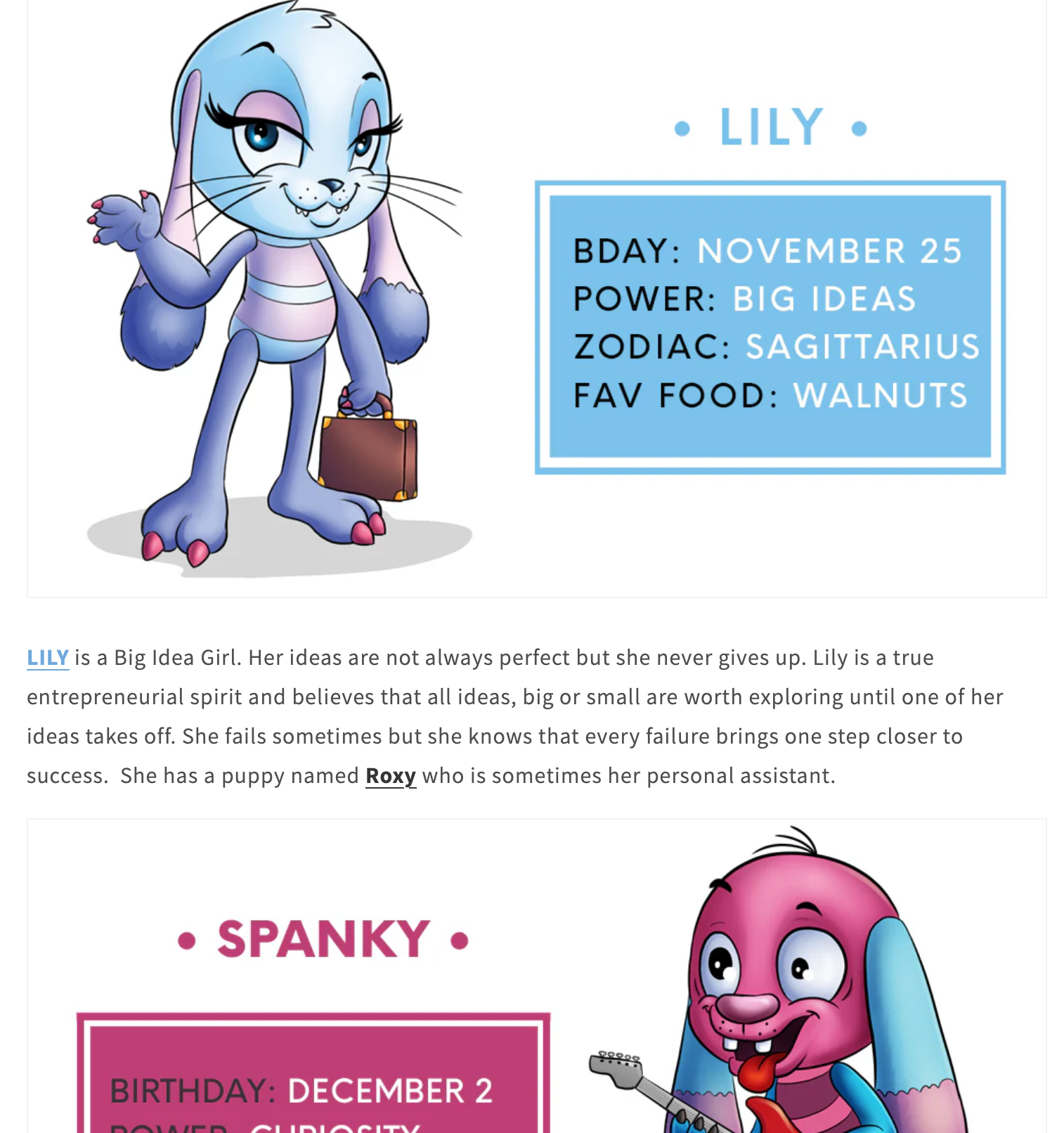
As you browse, notice how each character comes to life, making it feel less like a regular store and more like an adventure. You can use interactive elements like this in your store to keep customers entertained and invested in your products.
17. CRAFTD London
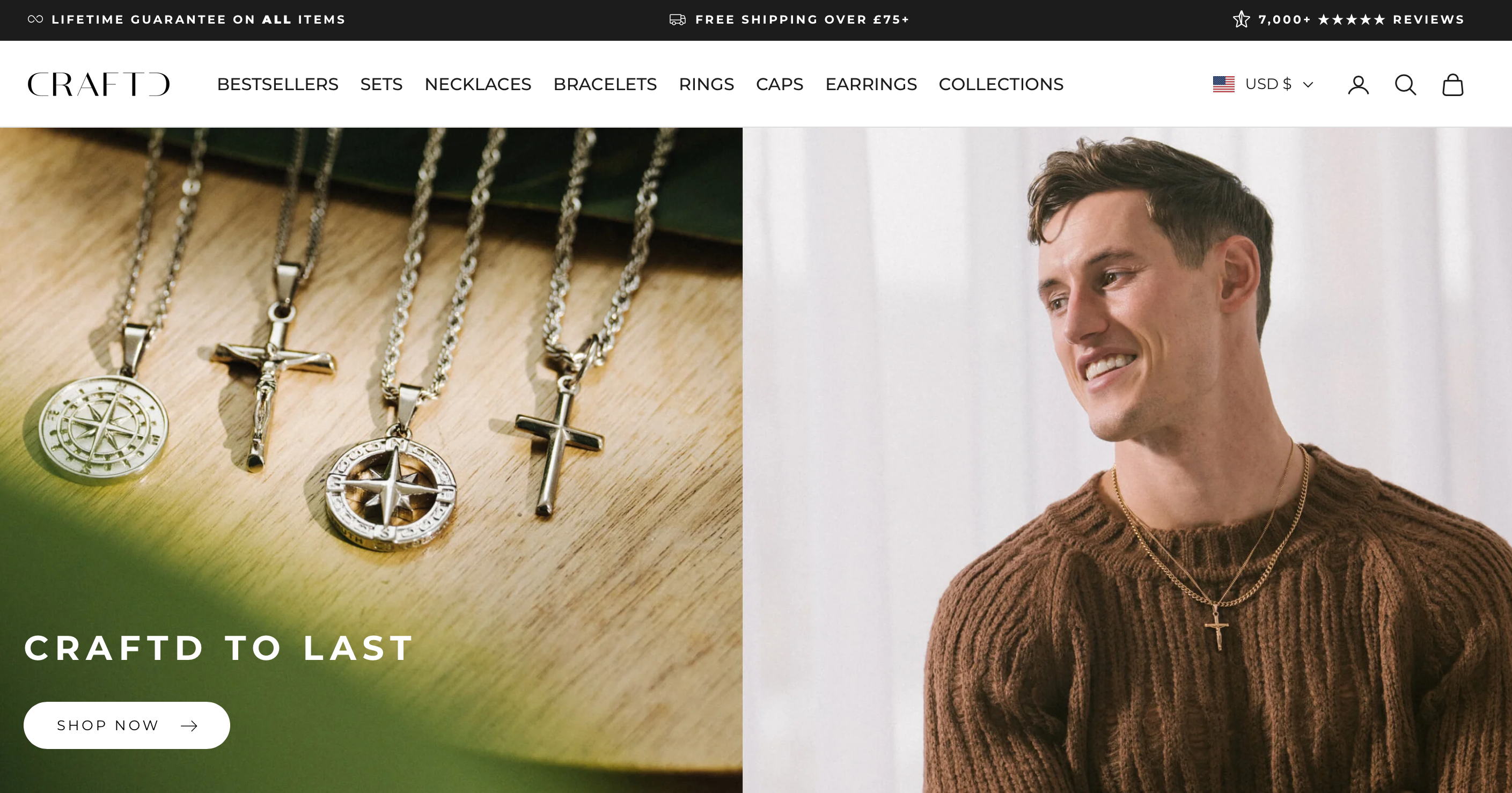
CRAFTD London is a premium jewelry brand that sells high-quality, durable pieces designed for men. With their focus on combining luxury and affordability, they have become a popular choice for everyday wear, growing a solid customer base of over 500,000 men globally.
Here’s what you can take from CRAFTD London
Luxury feel at affordable prices: CRAFTD London emphasizes quality without the high price tag. Their sleek, minimalistic website design enhances the luxury feel. You can communicate value by combining a clean design with transparent pricing.
High-quality product images: Check out their product pages, where each item is shown from different angles and in high definition. This allows customers to see the intricate details. You can use high-quality images to make your products look their best and build trust with potential customers too.
Strong brand identity: They reinforce their brand’s identity with storytelling, showcasing their passion for craftsmanship. This adds a personal touch and sets them apart. You can create a strong identity by telling your brand’s story and showing what makes your products special.
18. Colour Pop
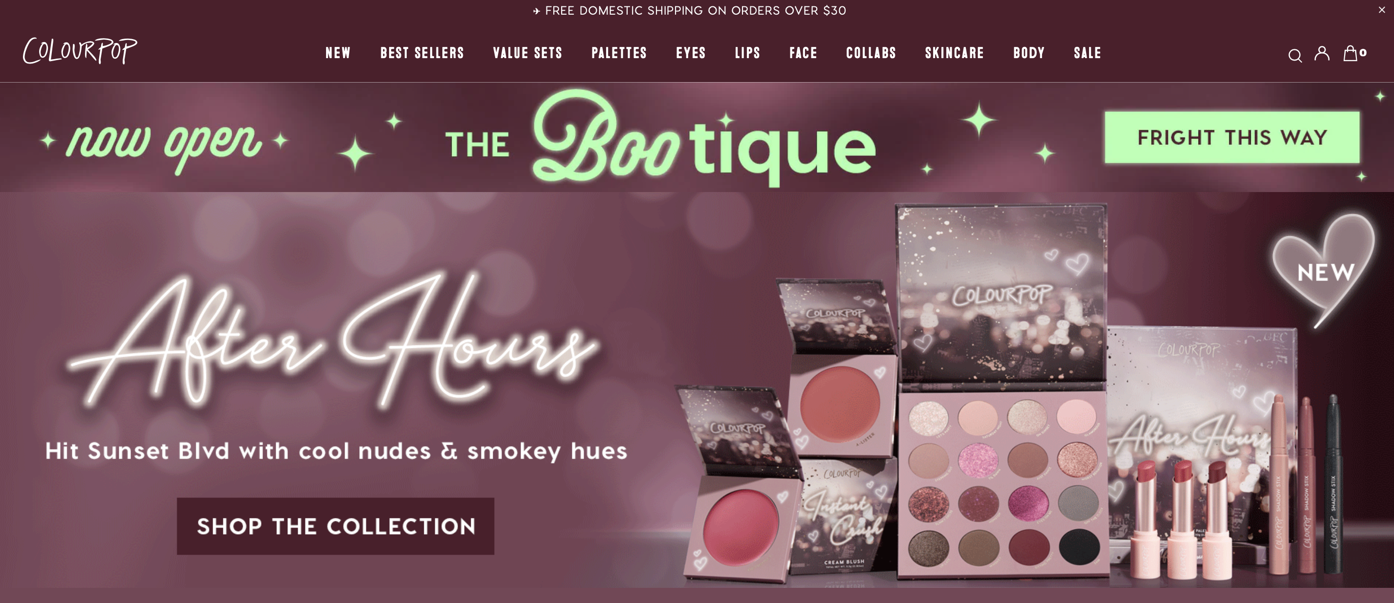
Colour Pop is a makeup brand that has exploded in popularity, known for its high-quality, affordable cosmetics and frequent collaborations with influencers. In 2025, ColourPop continues to dominate the cosmetics market, driven by its innovative approach to beauty and affordability.
Here’s what you can learn from Colour Pop
Bold and bright design: The first thing you’ll notice when you visit their site is the vibrant colors and bold visuals. This perfectly matches their playful, colorful product range. You can use a bold design that aligns with the energy of your products to attract your target audience.
Limited edition products: Colour Pop often releases limited-edition collections, creating urgency for customers to buy before they sell out. You can use limited-time offers or exclusive products to encourage quick purchases.
19. Sage & Sill
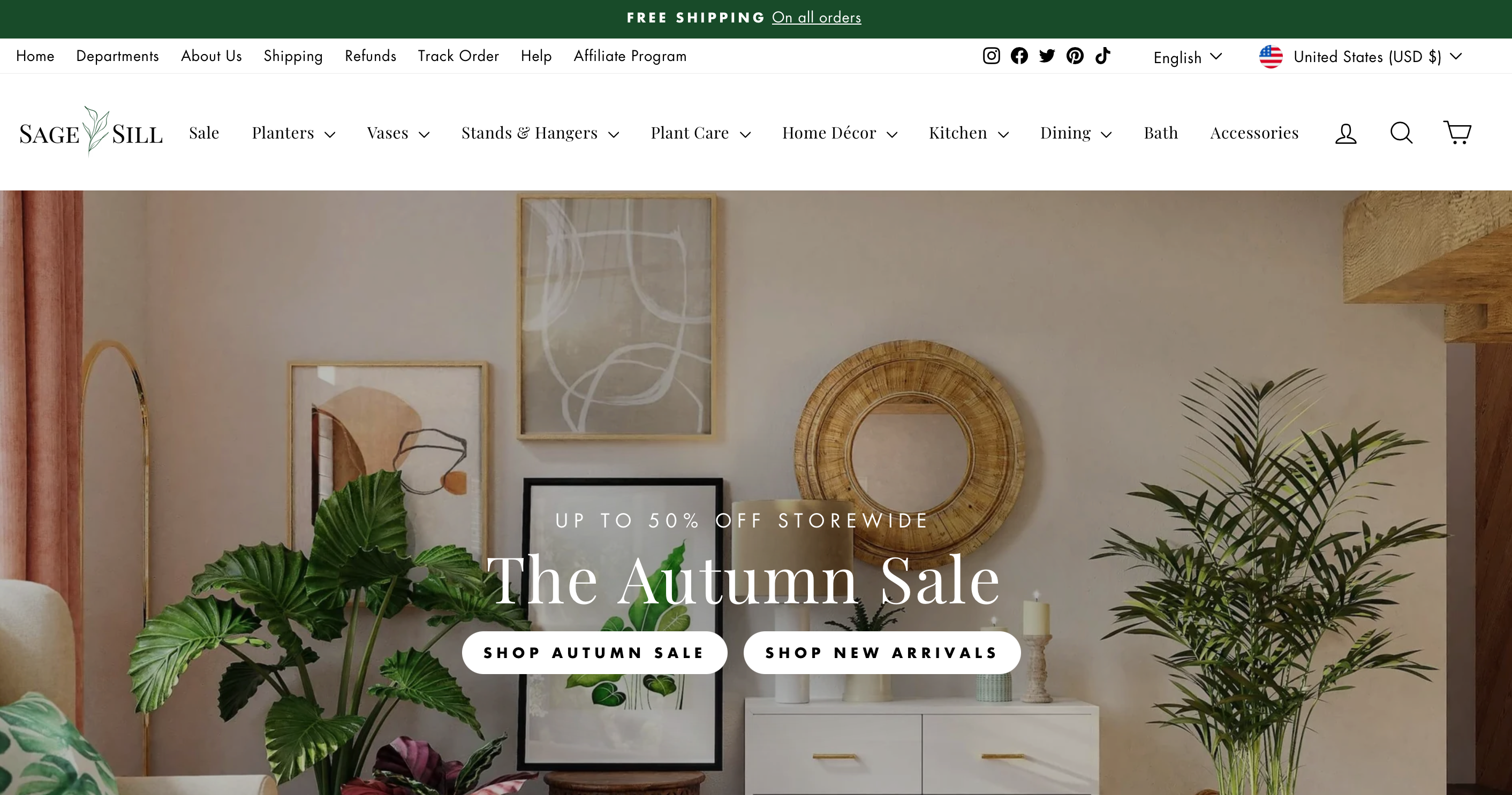
Sage & Sill offers premium faux plants that bring the beauty of nature indoors without the need for upkeep. Their products have become popular with busy professionals and homeowners seeking low-maintenance greene.
They have gained popularity with busy professionals and homeowners seeking low-maintenance greenery, especially as demand for indoor plants continues to rise.
Here’s how you can learn from Sage & Sill
Natural, calming design: Their website has a calm, earthy tone that mirrors the tranquility of their products. This aesthetic makes customers feel relaxed and connected to nature. You can design your site with colors and visuals that reflect the mood you want to create for your brand.
Detailed product descriptions and features: Each plant comes with detailed descriptions, showing size, materials, and styling ideas. This helps customers visualize how the plants will look in their homes. You can provide detailed product information to make it easy for customers to understand and trust your products.
Use of lifestyle images: They show their plants in beautiful room settings, helping customers imagine the products in their own spaces. You can use lifestyle images to help customers see how your products fit into their lives.
20. MrFlufflyFriend
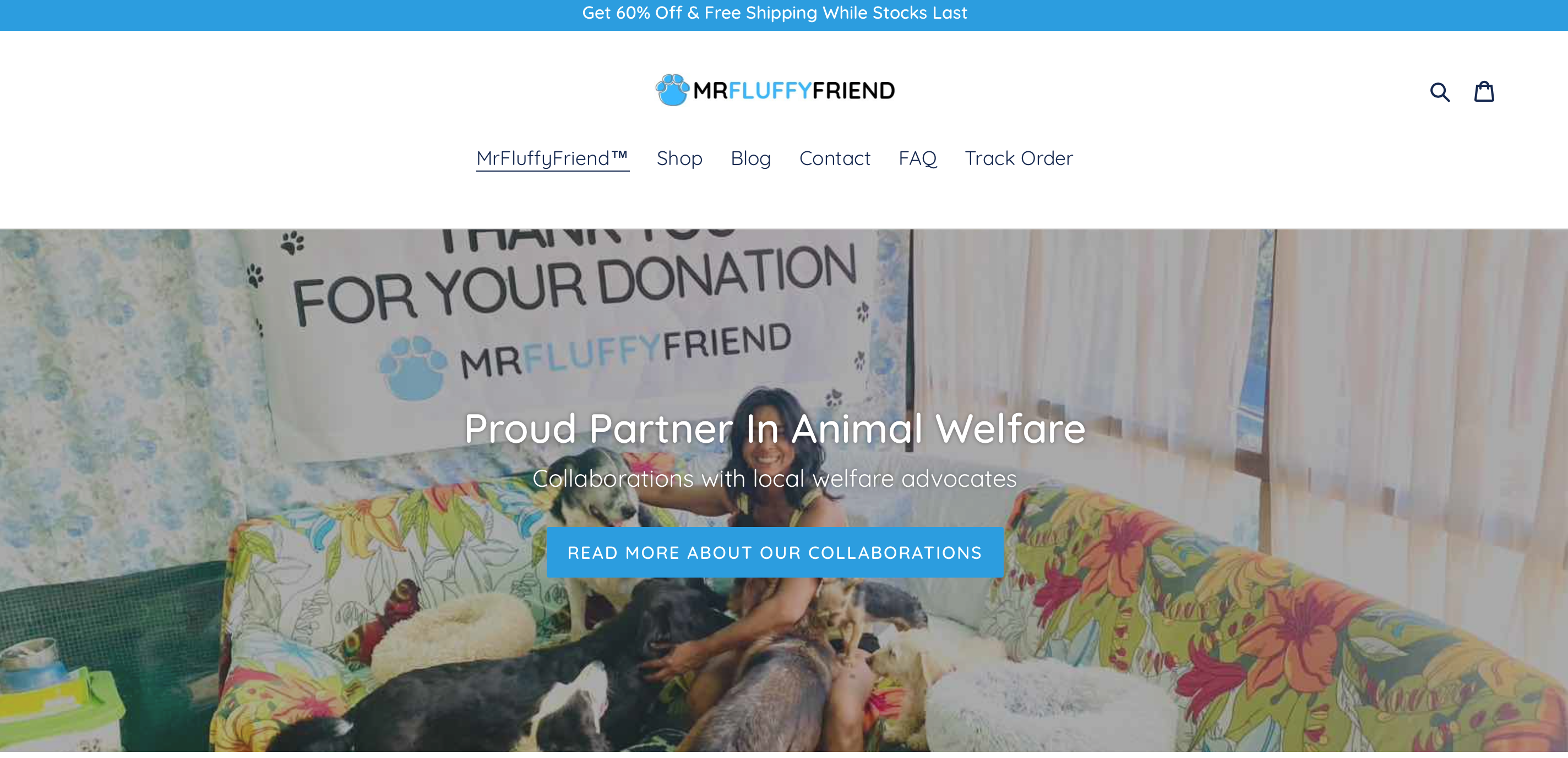
MrFluffyFriend specializes in high-quality pet beds designed to reduce anxiety and stress in pets. With over 600,000 satisfied customers, they have become a popular choice for pet owners prioritizing comfort and relaxation for their furry companions .
Here’s what you can learn from MrFluffyFriend
Explore product categories designed for specific needs: MrFluffyFriend’s products are organized with a clear focus on reducing stress and anxiety for pets. By addressing specific needs, such as pet anxiety, they appeal to a niche market. You can apply this by organizing your products around the specific problems they solve, making it easy for customers to find what they need.
Highlight product benefits and discounts: On the product pages, MrFluffyFriend clearly outlines how their beds provide comfort and help reduce pet anxiety. They also offer attractive discounts, like 60% off and stackable discounts for multiple purchases. You can use a similar approach by highlighting key product benefits and offering special deals to boost sales.
21. Bicycle Booth
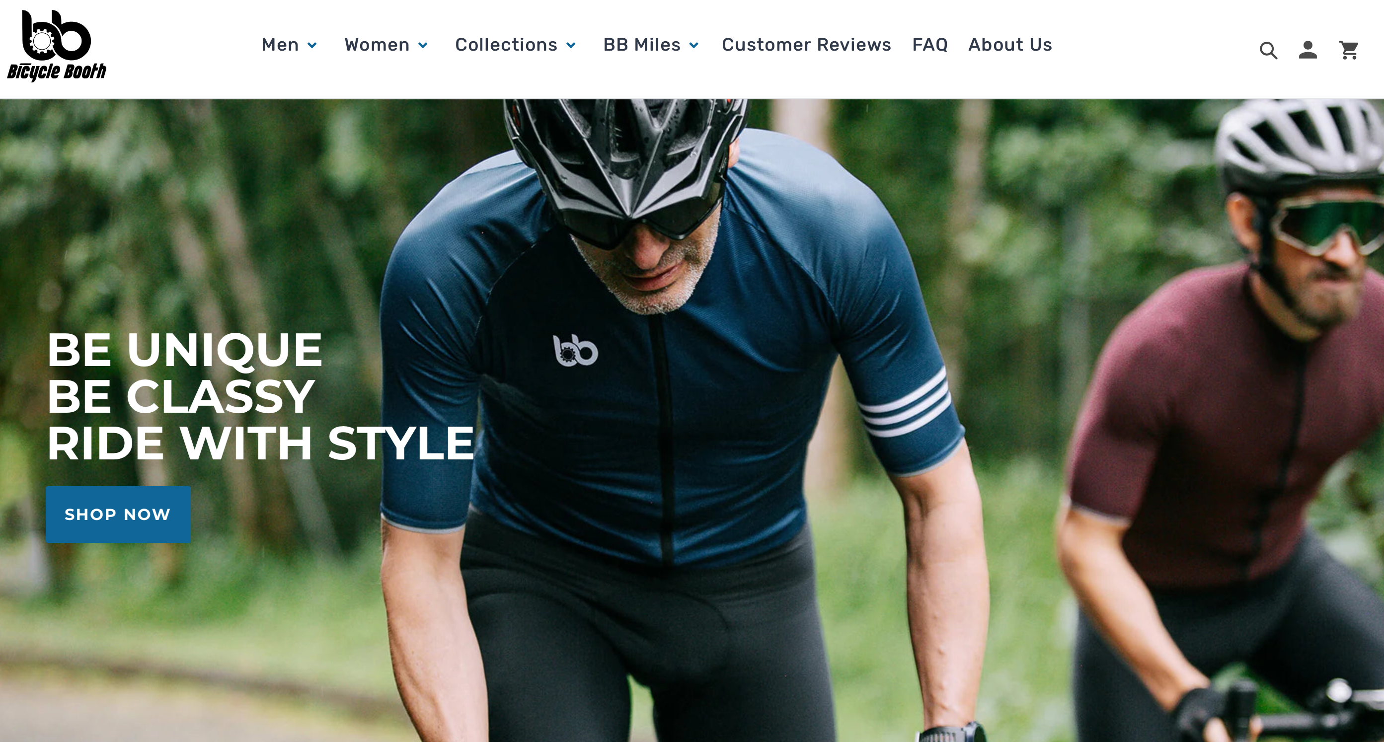
Bicycle Booth is a cycling gear store that sells high-performance apparel for biking enthusiasts. Their combination of function and style has helped them carve a niche in the activewear market, attracting a loyal customer base among cycling communities.
Here’s what you can learn from Bicycle Booth
Niche focus on cycling enthusiasts: The website is fully dedicated to cycling gear, and this clear focus appeals to their target audience. If you have a niche market, make it obvious from the moment customers land on your site to build a strong connection with your core audience.
Showcasing product durability: Each product page includes detailed descriptions and videos that highlight the durability and performance of their gear. This helps build trust with customers who are serious about high quality products. You can do the same by providing clear, thorough information about your products’ strengths.
Interactive community section: Bicycle Booth has a section where customers share photos of themselves in the gear.
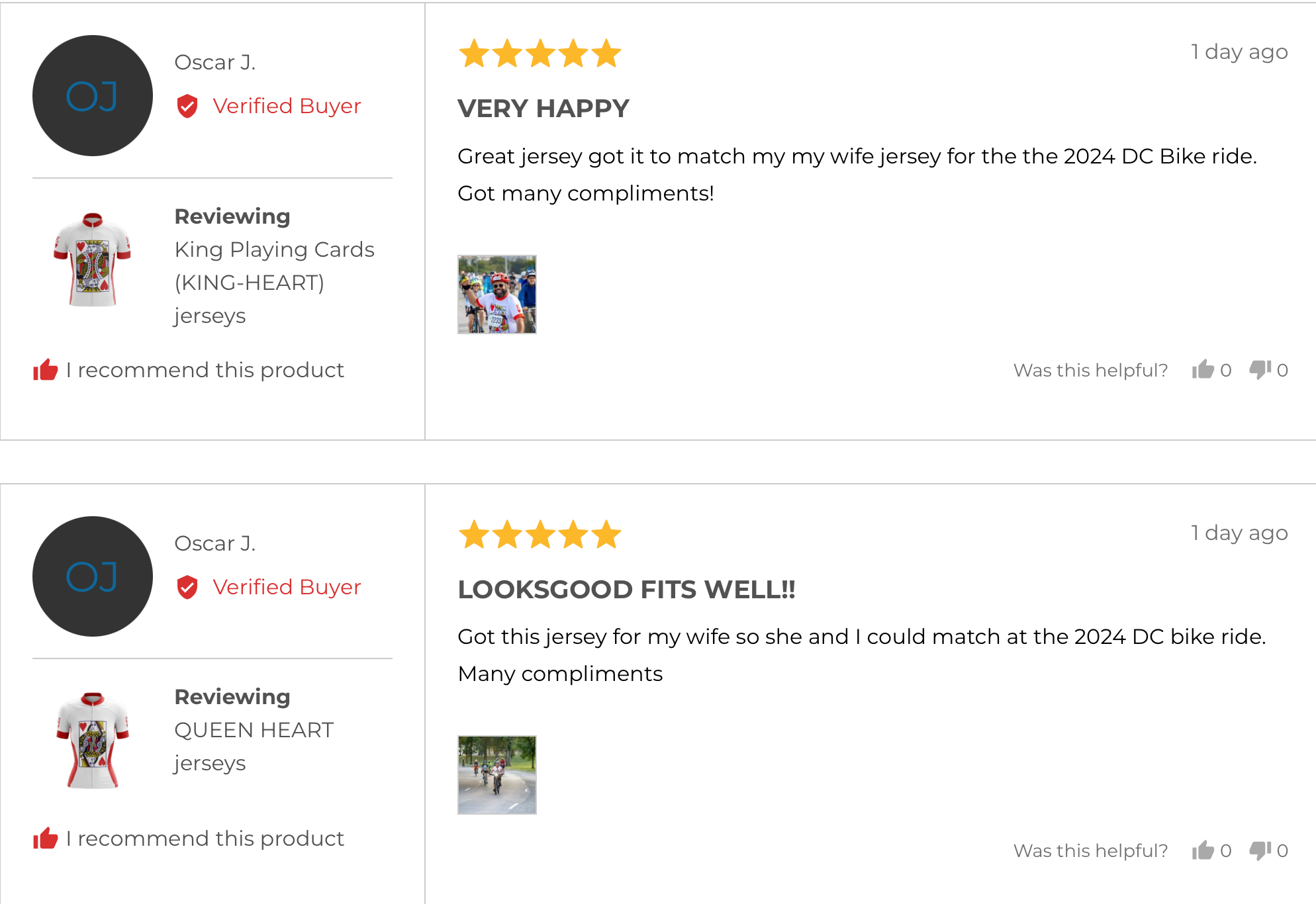
This kind of user-generated content builds trust and fosters a community feel. Encourage your customers to share their experiences to create a stronger connection to your brand.
22. Epic Loot Shop
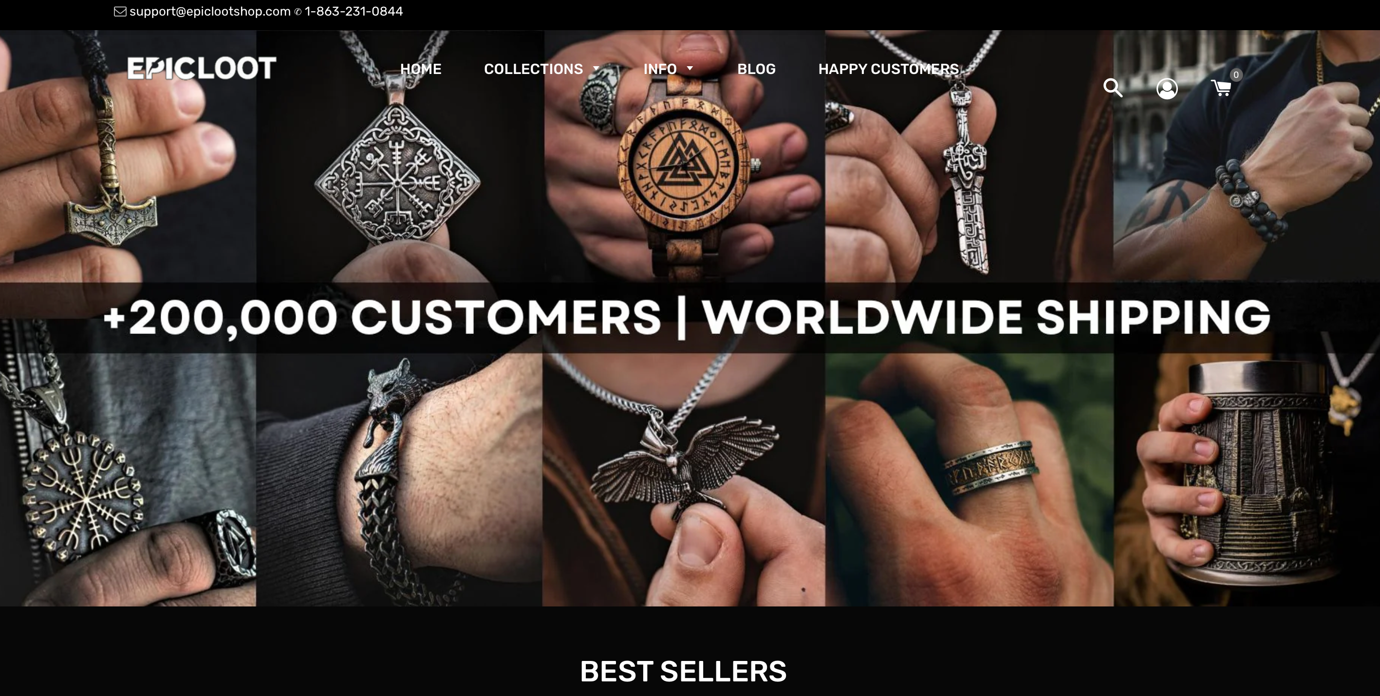
Epic Loot Shop offers a wide range of Viking-themed jewelry and accessories, including rings, necklaces, and bracelets.
They focus on Norse mythology and symbols, appealing to fans of Viking culture and history. Their unique focus on Viking culture has made them a go-to for fans of historical and mythological items.
Here’s what you can take from Epic Loot Shop
Targeted niche products: From the moment you land on their homepage, you know that Epic Loot Shop is niche store that focuses on Viking-themed jewelry and accessories. Their clear dedication to Norse mythology attracts a loyal community of Viking culture enthusiasts. If your store has a specific niche, make it obvious from the start, so customers feel connected and engaged.
Exclusive merchandise: They highlight exclusive items that are only available in their store. This creates a sense of urgency and excitement among fans. You can boost sales by offering limited-edition products or exclusives that aren’t available anywhere else
23. HELM Boots
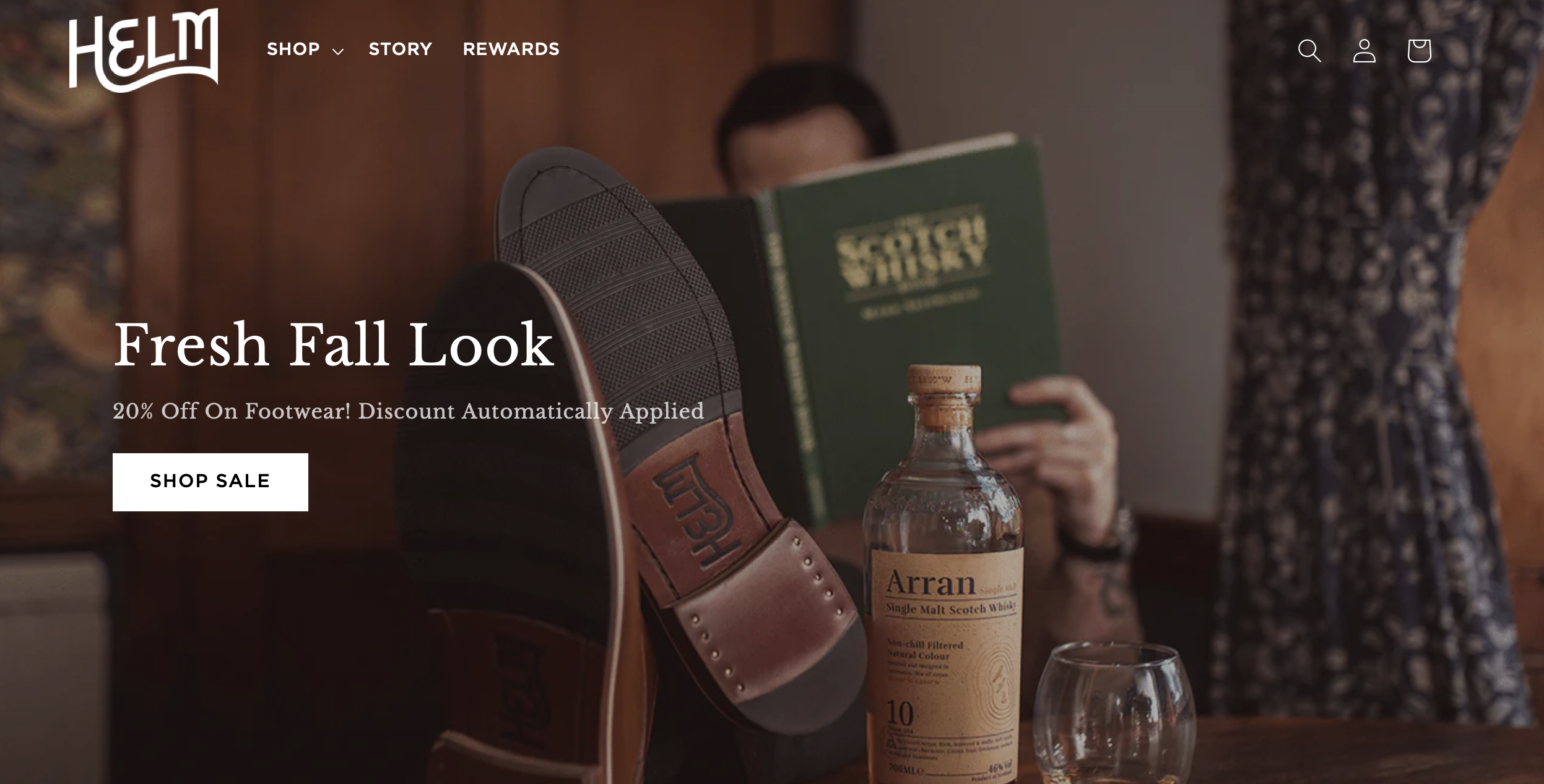
HELM Boots is a top seller of handcrafted leather boots, known for their quality and durability. With a reputation for blending style and craftsmanship, HELM has attracted a growing customer base that values both form and function in footwear.
Here’s what you can learn from HELM Boots
Take a look at their attention to detail: When you visit their product pages, you’ll see a focus on craftsmanship, with detailed descriptions of materials and how each boot is made. This transparency helps customers appreciate the value of what they’re buying. You can apply this by clearly explaining what makes your products unique.
Check their premium branding: The website is sleek, with a clean layout that reinforces their luxury image. This boosts trust and gives the impression of high-end product quality. You can elevate your own brand by using professional design elements that reflect your product’s value.
24. Ruggable
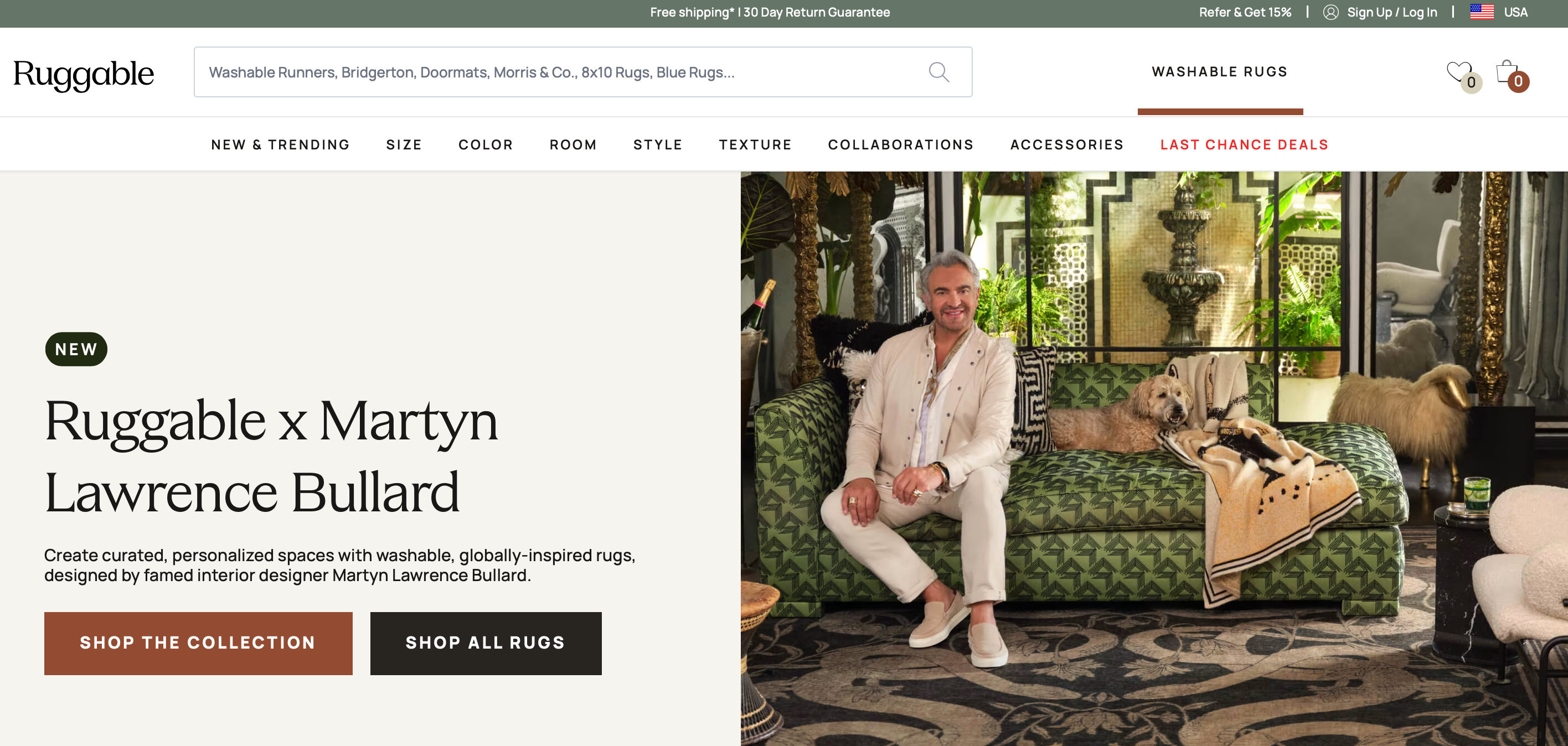
Ruggable sells washable rugs, perfect for busy homes. Their innovative design has made them a go-to for practical, stylish rugs.
As of January 2025, Ruggable generated $23.9 million in revenue, continuing to lead the washable rug market due to its blend of style and practicality.
Here’s what stands out about their strategy
Notice their product innovation: On their homepage, Ruggable immediately emphasizes the washable feature of their rugs. This helps customers understand the key, unique selling point. You can grab attention by focusing on what makes your product stand out.
See how they build trust: Ruggable includes lots of lifestyle images, showing their rugs in stylish home settings. This helps customers picture how the rugs will fit into their space. You can use similar imagery to help customers connect with your products on a personal level.
25. Gymshark
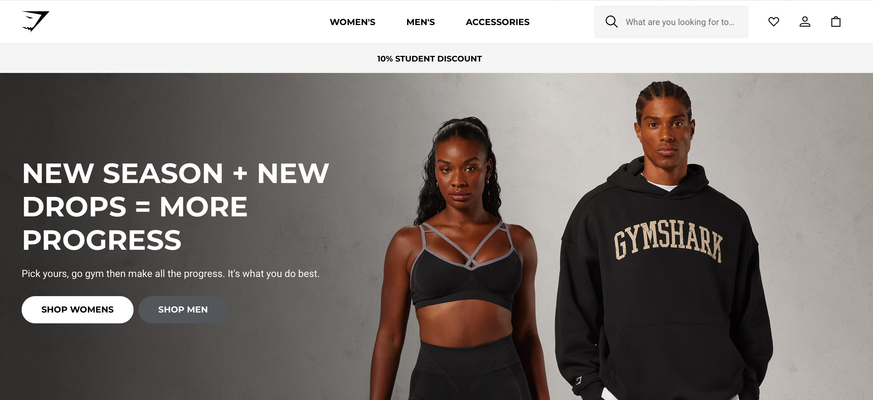
Gymshark is a leader in fitness apparel, offering high-quality, performance-driven clothing that has become popular globally. In 2025, Gymshark reached a revenue of approximately $500 million, cementing its place as a top brand in the fitness industry.
Take a closer look at what makes their approach successful
Pay attention to their social strategy: Gymshark’s homepage features direct links to their social media platforms and collaborations with fitness influencers. This creates community engagement. You can build a stronger following by connecting your store with social media and leveraging influencer marketing.
Strong customer engagement: Gymshark highlights customer reviews and testimonials right on the product pages. This kind of social proof reassures new buyers. You can use customer reviews to build trust and show potential buyers that your products are well-loved.
26. SkinnyMe Tea
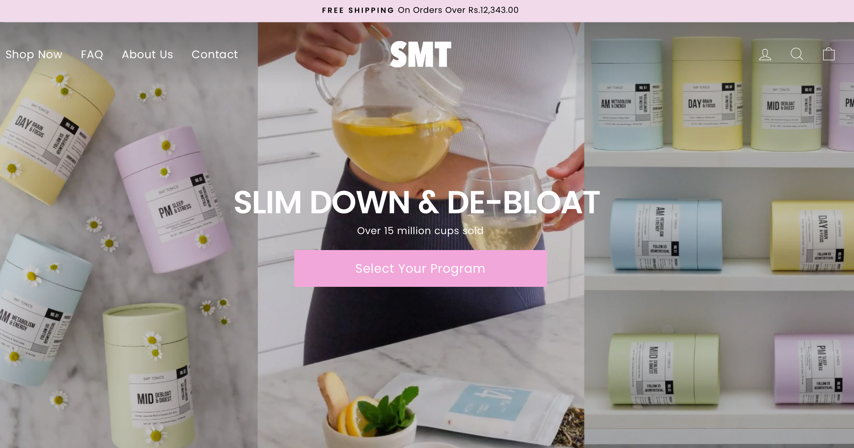
SkinnyMe Tea offers detox teas and has built its brand by promoting health and wellness. The brand has achieved significant growth, benefiting from the rising demand for health-focused products.
Here’s how they’ve made their brand stand out
Explore how they emphasize benefits: On their product pages, SkinnyMe Tea clearly outlines the health benefits of each tea, making it easy for customers to see why they should buy. You can draw attention to how your products solve specific problems or enhance your customers’ lives.
Notice their use of transformations: They showcase real customer results with before-and-after photos, which helps build credibility. You can encourage customers to share their results or stories to inspire others to trust your brand.
27. FitTrack
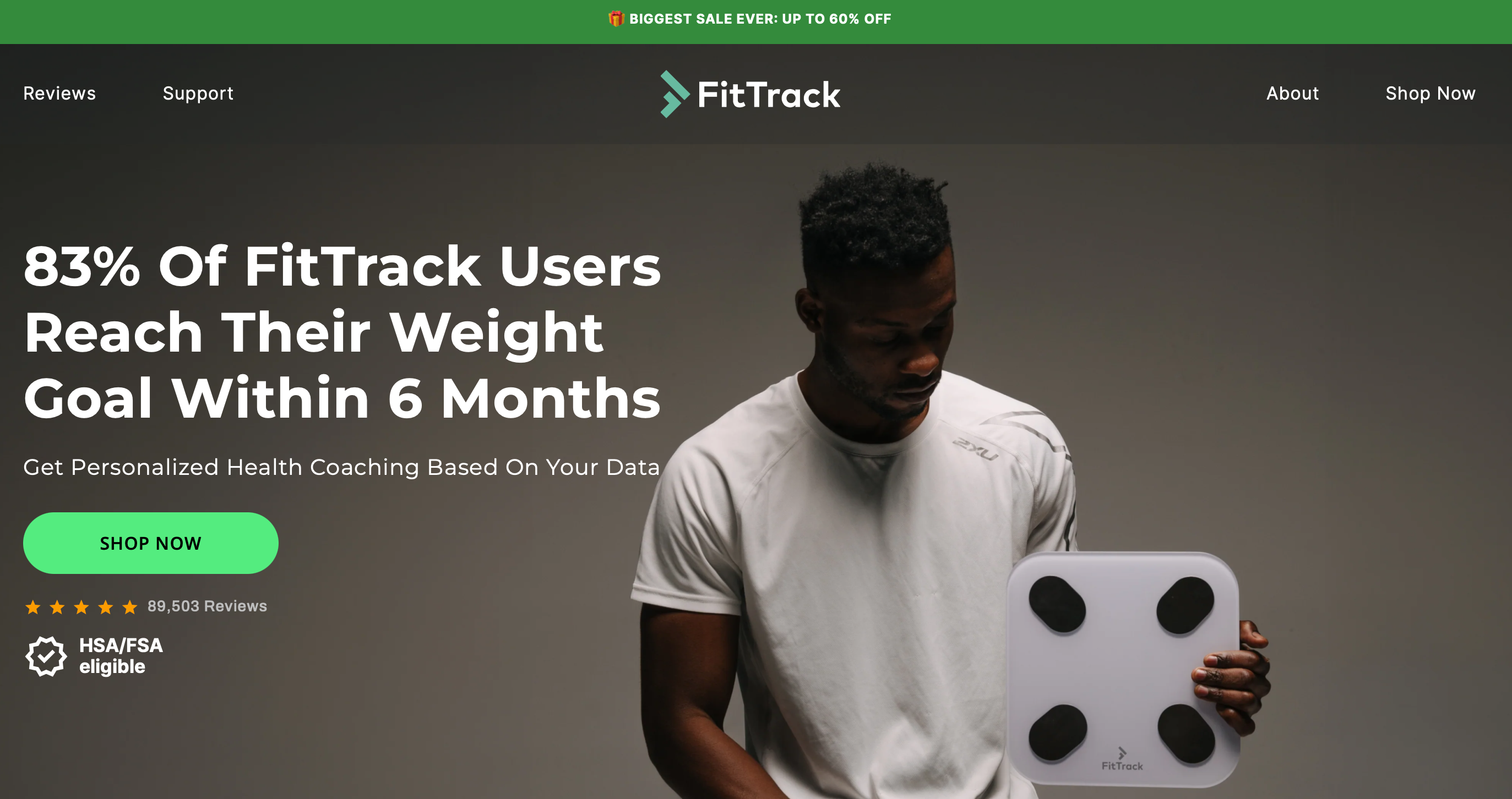
FitTrack sells smart health devices like scales that track body composition, appealing to health-conscious customers. FitTrack’s smart scales have become more popular as more people look for easy ways to track their health.
Notice the tactics they use to engage customers
Look at their use of data: FitTrack’s product pages emphasize the detailed health data their products offer, like body fat percentage and hydration levels. This appeals to fitness enthusiasts who want in-depth insights. You can attract similar customers by highlighting how your product provides valuable, actionable information.
Check out their product demo videos: FitTrack uses videos to show exactly how their products work. These help customers visualize the product in use. You can improve customer understanding by including demo videos that showcase your product’s features and benefits.
28. Luxy Hair
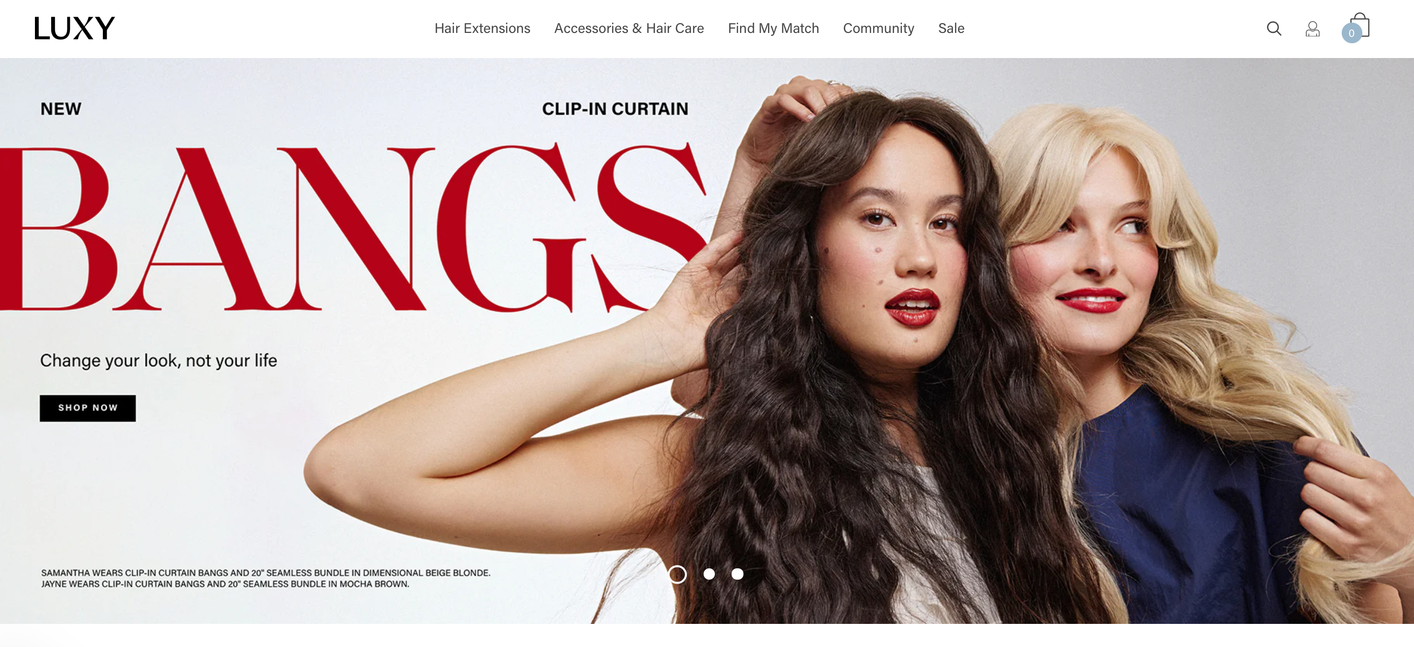
Luxy Hair is known for selling premium hair extensions and educating customers through tutorials. FitTrack’s smart scales have become more popular as more people look for easy ways to track their health.
Here’s how to capture attention in their niche
Notice their educational approach: Luxy Hair doesn’t just sell products—they provide value through tutorials. This makes customers feel more confident in their purchase. You can use educational content like how-to guides or videos to give your customers extra value.
Explore their influencer partnerships: Luxy Hair works with influencers to showcase real-life use of their extensions. These partnerships help build trust and broaden their reach. You can grow your brand by collaborating with influencers who resonate with your target audience.
29. Mivimall
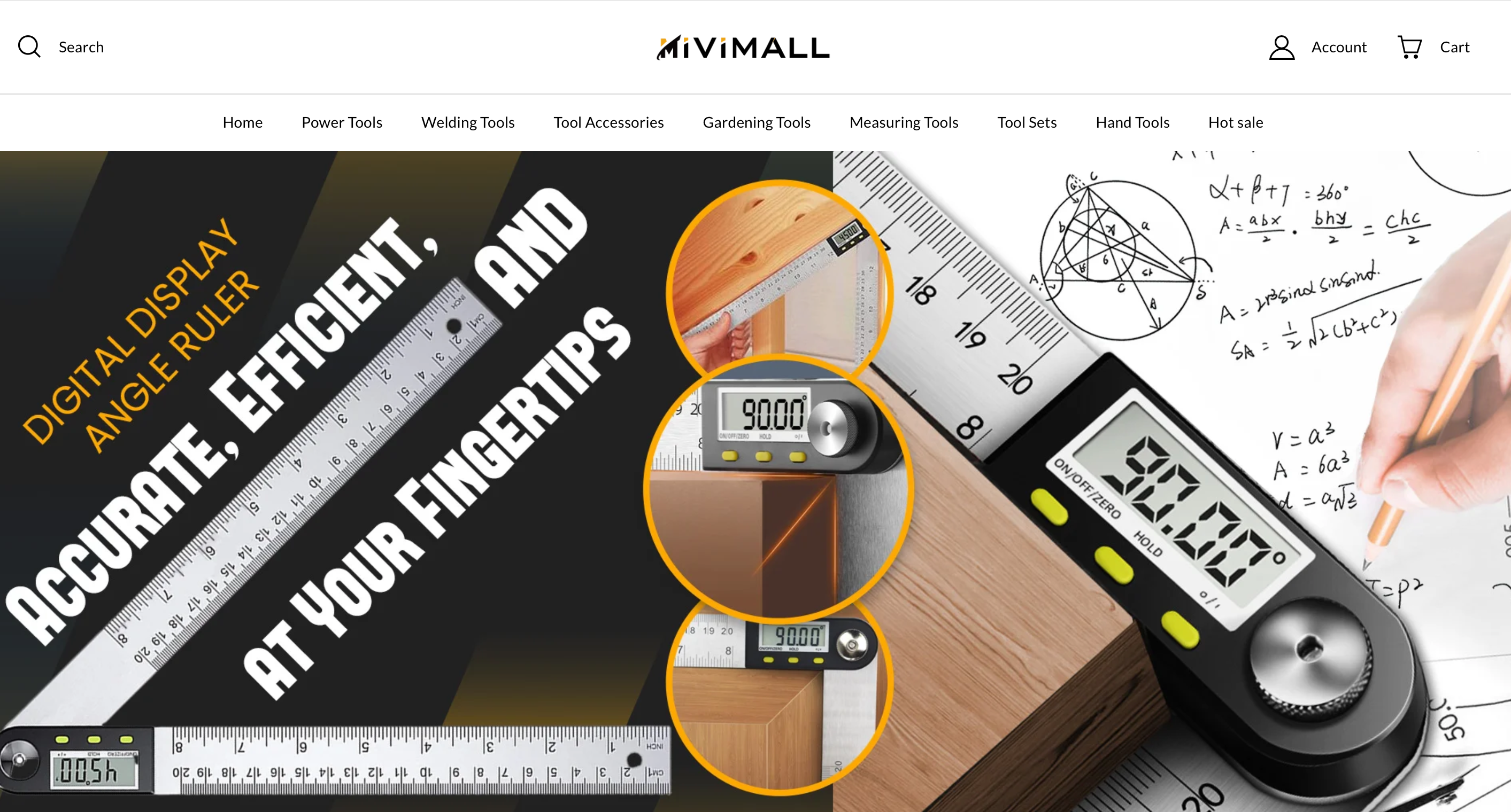
Mivimall offers affordable tech gadgets and accessories, focusing on trendy and practical items.
This is how they set their approach apart
Check their simple design: Mivimall’s clean and minimalist website makes it easy for customers to browse and find products. This simplicity keeps the focus on the products. You can enhance your store by simplifying the design to avoid distractions.
Spotlight on bestsellers: Mivimall highlights its best-selling items right on the homepage. This draws customers’ attention to what’s popular. You can boost sales by showcasing your most popular or trending products prominently on your site.
30. The Sill
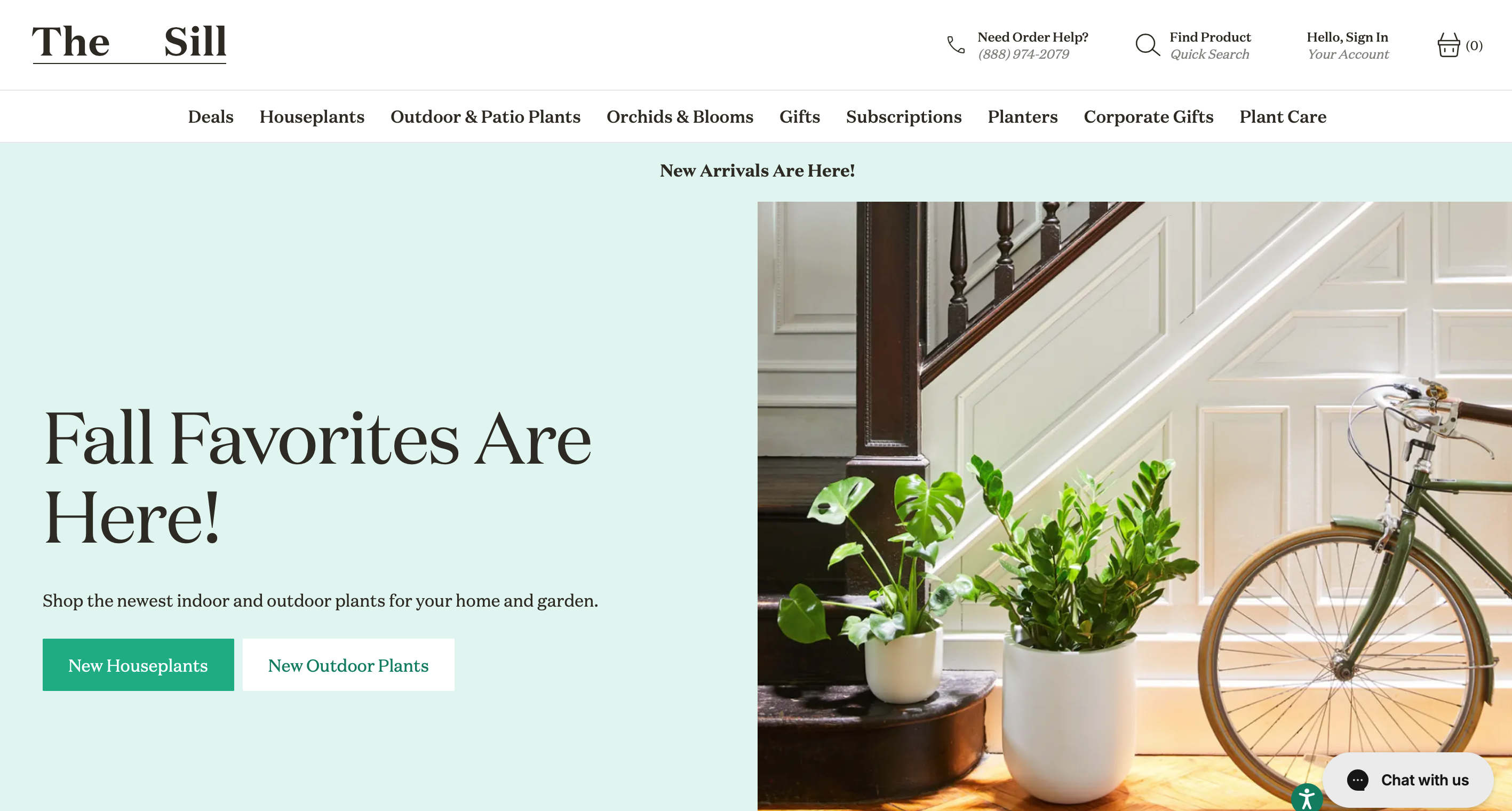
The Sill sells houseplants and has made plant care accessible to beginners. The houseplant market continues to thrive, and The Sill has become a key player, growing steadily as the demand for low-maintenance, indoor plants increases.
Let’s explore how they drive their success
See how they educate customers: The Sill offers plant care tips and guides, making it easy for new plant owners to succeed. This helps build long-term customer loyalty. You can provide similar educational content to help your customers make the most of your products.
Check their lifestyle images: The Sill uses images of plants in styled homes, helping customers visualize how the plants will look in their own space. You can make your products more relatable by showing them in real-life settings that your customers can identify with.
Successful Shopify Dropshipping Store: FAQs
Here are some common questions about running a successful dropshipping store:
1. What Is A Dropshipping Store?
A dropshipping store is an online store where store owners sell products without holding inventory. Instead of managing stock, the dropshipping suppliers handle order fulfillment.
This model makes it easy to run a business, as you don’t need to invest in bulk products. Many dropshipping online stores operate using platforms like Shopify, making it simple to start and scale a successful dropshipping store.
2. Which Store Is Best For Dropshipping?
The best Shopify dropshipping stores are those that partner with reliable dropshipping suppliers, offer high-quality dropshipping products, and provide a smooth shopping experience for customers. Successful examples often feature a unique niche, great customer service, and effective marketing strategies.
If you want to build the best Shopify dropshipping store, look for suppliers who can provide fast shipping, excellent products, and competitive prices.
3. How To Find Dropshipping Stores?
You can find many dropshipping stores by searching on platforms like Shopify or browsing curated lists of the top Shopify dropshipping websites and stores.
Online directories often rank Shopify stores based on their performance, customer satisfaction, and the quality of their dropshipping products. You can also check out forums and social media to find store reviews and recommendations from other store owners.
4. Which Store Is Free For Dropshipping?
While most Shopify stores require some fees to operate, there are options to start a dropshipping business for free on platforms like Oberlo and AliExpress.
These platforms allow store owners to connect with dropshipping suppliers and test out products with minimal upfront costs.
Though many free options are available, it’s often beneficial to invest in paid tools to create a more professional and successful dropshipping store.
5. How Do I Start Dropshipping?
To start your own Shopify dropshipping store, begin by choosing a niche and selecting dropshipping products that appeal to your target market. Next, find reliable dropshipping suppliers who can offer quality items and timely shipping.
Set up your online store using Shopify’s platform, customize it to suit your brand, and promote it through social media and paid ads. With the right strategy, you can grow a successful ecommerce website dropshipping business from scratch.
Conclusion
These Top 20+ Shopify dropshipping stores showcase what’s possible when you find the right niche, deliver high-quality products, and connect with your audience.
Each store has its own unique strengths, whether it’s standout design, smart marketing, or building a loyal community. As you work on growing your own dropshipping store, remember to stay focused on your target market and always look for ways to improve your customers’ experience.
Maria is a marketing specialist with hands-on experience in digital growth strategies and eCommerce.
As part of the Sell The Trend team, she has developed deep expertise in dropshipping through close work with product research, trend analysis, and go-to-market strategies used by successful online sellers.
Her content focuses on practical marketing insights, audience behavior, and data-driven decision-making to help merchants launch and scale with confidence.


